Quanata's Distracted Driving Case Study 2024
In September 2024, Quanata shared a Distracted Driving case study with their customers and the general public. It was distributed via social media and a dedicated microsite that provided an introduction to the case study and an option for download. Through this content, Quanata aimed not only to tell a story about what they did and how they made a difference, but also to highlight their potential to drive broader change in the future—the "future of" conversation. In doing this they would also begin to establish the perceptions they wanted to set as a brand, and drive awareness and credibility amongst their target audiences.
Who is Quanata?
Quanata is a risk-prediction company that leverages AI-assisted modeling, real-time telematics, and risk-based acquisition innovations to enhance driver safety and help insurers more effectively predict and prevent risks.
By creating context-based insurance solutions, Quanata merges telematics-enabled products with persuasive technology and data-driven insights to encourage safer driving behaviors and align with the evolving needs of insurers.
Their partnership with State Farm, along with their work through their own insurance company, HiRoad, provides a stable platform for the development and deployment of these innovations.
Goal for target audience:
• Become more familiar with Quanata's brand, understand their mission and the solutions they offer.
• Think of Quanata as a trusted resource in the space that, like scientists, prioritize searching for actionable insights that are testable and scalable. They hope to achieve this by presenting their findings with clear communication and novel data visualization.
• Believe Quanata can execute their offerings intelligently. The way they process data allows them to learn, adapt, and stay at the forefront of informed decision making.
Case study overview
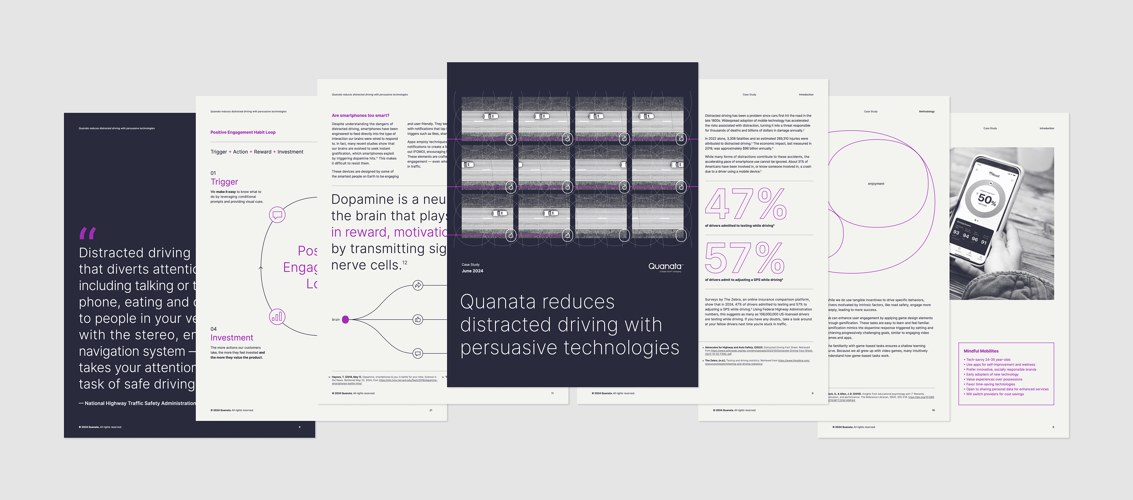
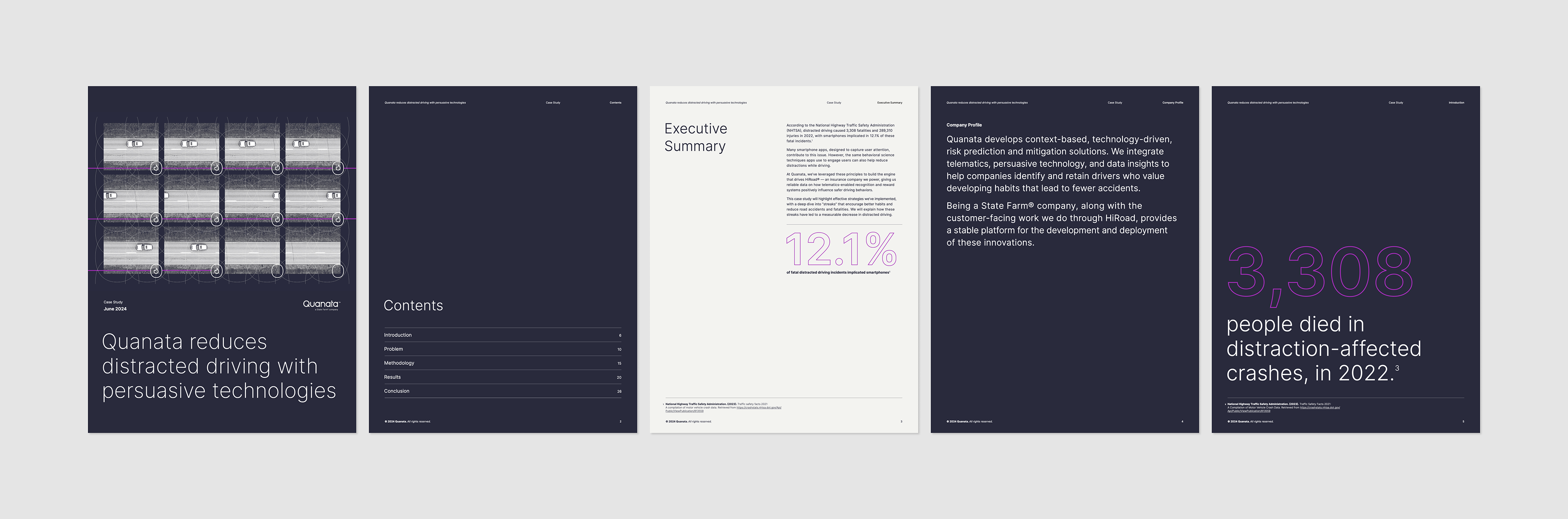
According to the National Highway Traffic Safety Administration (NHTSA), distracted driving caused 3,308 fatalities and 289,310 injuries in 2022, with smartphones implicated in 12.1% of these fatal incidents.
Many smartphone apps, designed to capture user attention, contribute to this issue. However, the same techniques apps use to engage users can also help reduce distracted driving.
Quanata leveraged these principles for HiRoad — an insurance company they power. This Distracted Driving case study highlights the effective strategies they've implemented to encourage better habits and reduce road accidents and fatalities.
Project details
Quanata's Distracted Driving case study was created using content collected and processed by a third-party researcher, following Quanata's instructions and guidelines. Members of Quanata's internal marketing team—consisting of two designers (myself included), one associate creative director, and one copywriter—brought the study to life within a tight timeline of just a few weeks. This project also served as a key test for our newly developed, in-progress brand guidelines, assessing their flexibility and usability in a real-world scenario.
Process
1. We began the project with an initial draft from our in-house copywriter, who had started shaping Quanata's voice and tone around the study results and findings.
2. After reviewing the draft, we began separating the content visually where necessary to reduce cognitive load and create a flow of information that felt effortless and would keep readers engaged.
3. We researched and ideated on visual page layouts that would complement the copy while aligning with Quanata's evolving brand identity.
4. After establishing the first round of page layouts and designs, we shared them with stakeholders for review.
5. Based on feedback, we made several rounds of updates, including layout adjustments, copy edits, and more focused image selection.
6. To ensure pixel-perfect precision and proper document output, we transferred the designs from Figma to Adobe InDesign, building a grid and type system suited for this project and future Quanata needs.
7. The finalized InDesign document was uploaded to a Miro board for another round of stakeholder review, where we continued to refine the layout and data visualizations.
8. Final designs were created and uploaded to all necessary folders and project management tickets.
9. We designed social media visuals and a microsite to introduce the case study and offer it for download.
10. The case study, microsite, and social media posts were successfully launched in September 2024.
Scope of work
Case study PDF document
Case study microsite
Social media posts (LinkedIn, Blog & Instagram)
Timeline
5 weeks
Published date
September 2024
Full Quanata case study
Design
For the design of the Quanata Distracted Driving case study, we had the added responsibility of contributing to the development of Quanata's brand guidelines. It was crucial to reflect the core concepts that Quanata aimed to highlight, with credibility and innovation as the two overarching principles we sought to convey.
Through exploration, we identified key attributes that helped define Quanata's brand identity:
• Intelligent
• Scientific
• Technological
• Layered (convergent, contextual, cause and effect)
• Dynamic
We aimed to express these qualities through precise grid and typography systems, tech-inspired visualizations, clear communication, dynamic layouts, and distinctive callouts. The goal was to create a design that felt carefully constructed, offering an engaging, educational experience while embodying the thoughtful, innovative essence of the Quanata brand.
Shared Responsibilities
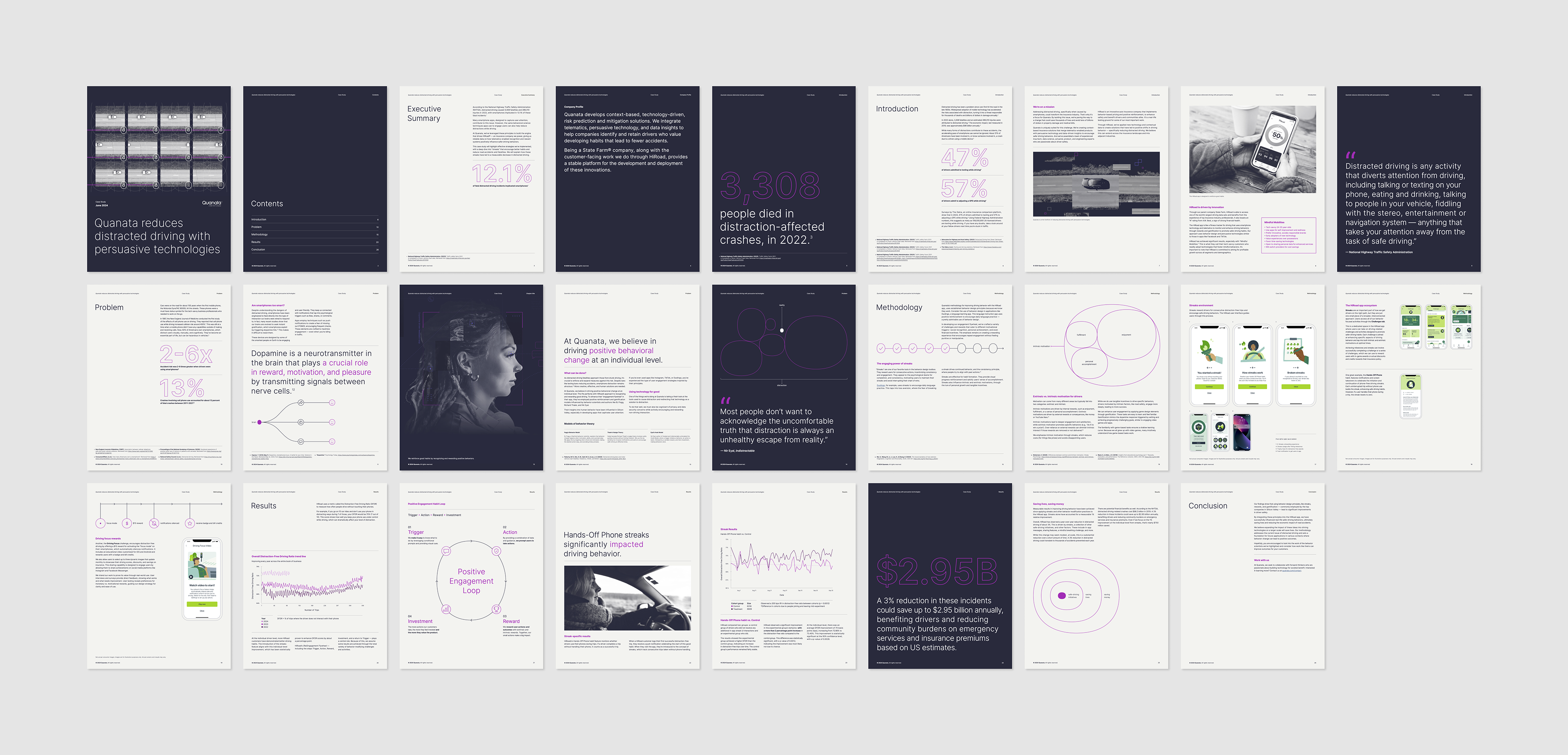
Pagination & page design
Every element of the page layout was carefully considered to reduce cognitive load and guide the reader effortlessly from one section to the next. We used strategic background colors and consistent grid systems to establish the structure and rhythm of the document, making navigation intuitive and the overall experience aesthetically pleasing. Each page was unique, yet maintained consistent elements and grid rules, which contributed to the structure, endurance, and beauty of the designs.
To enhance readability and visually communicate complex ideas, we incorporated a range of design elements, including display typography, photography, line work, mockups, charts, and data visualizations. These elements were crucial in shaping Quanata’s brand identity, creating a cohesive look and feel that built recognition and trust. Our design aimed to capture attention, create an emotional connection, and reinforce the impact of Quanata's message, while ensuring the information was accessible, clear, and memorable.
My Responsibilities
Grid systems
• Type scale
• Figma to Indesign file recreation
• Indesign file creation and organization (grid & paragraph style creation, master pages, page layering system, etc.)
• Future PDF template including grids and styles
• Microsite design/mockup
Shared Responsibilities
• Pagination & page design
Tools
Figma, Indesign, Miro, Google Drive, Jira
Sample pagination
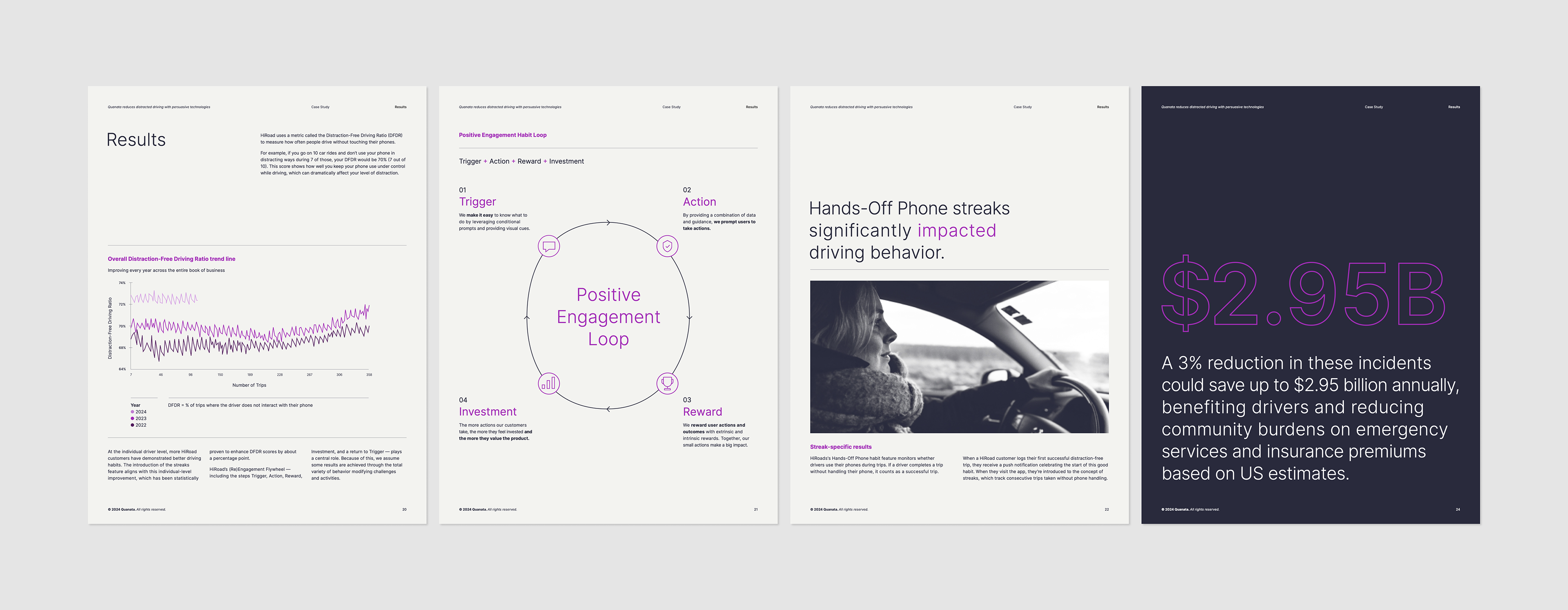
Sample elements from Results chapter
My Responsibilities
Grid systems
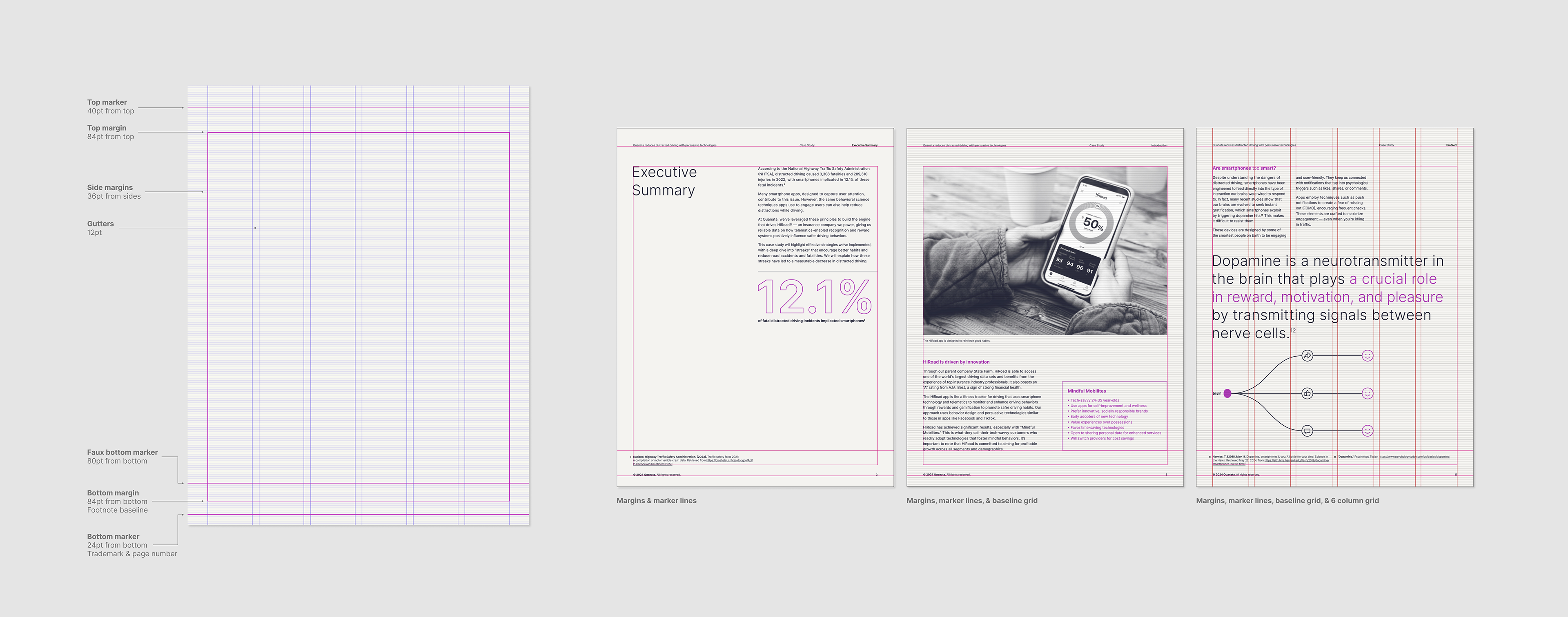
When designing the grid systems, I explored and tested various layout grid styles, including modular numeral grids, column/row grids, and row grids with strategically placed markers. These layout grid styles were tested in combination with a type baseline grid, which needed to integrate seamlessly with the overall design. After thorough testing, we settled on a 42-field modular grid with a 4pt baseline grid. As the project evolved, adjustments to the type styles, copy, and image layouts led us to adopt a 6-column grid with no rows, defined margins, and marker lines for page details.
Using both baseline and layout grids was essential in this project for achieving consistency, readability, and overall visual harmony. The baseline grid ensured that text aligned perfectly, creating a clean and structured appearance, while the layout grid provided a flexible framework for positioning images and other elements, maintaining balance throughout the design. This structured approach not only improved readability by guiding the viewer's eye smoothly across the content, but also streamlined the design process, allowing for quicker decision-making and easier collaboration. Additionally, using these grids ensured scalability across different media formats, and the organized, polished look reinforced and aligned with Quanata's goals of showcasing precision, professionalism and trustworthiness.
Grid styles breakdown
Type scale
With Quanata's brand guidelines still in development and no established type scale, this case study provided an opportunity to explore new facets of Quanata's brand identity. We experimented with various visual layouts and bold text treatments before refining our approach and focus. Once we finalized our designs and incorporated stakeholder feedback, it was my responsibility to convert them from Figma into InDesign. This ensured precise alignment using layout and type grids and allowed for the preparation of the final design package. This workflow allowed for collaborative brainstorming in Figma, followed by detailed refinement in InDesign. During this process, I created and optimized a type scale that complemented our Figma designs and established a consistent typographic system for future use. After exporting the initial case study PDF, we made several rounds of small visual and copy edits to complete the final version.
Case study type scale & Inter typeface

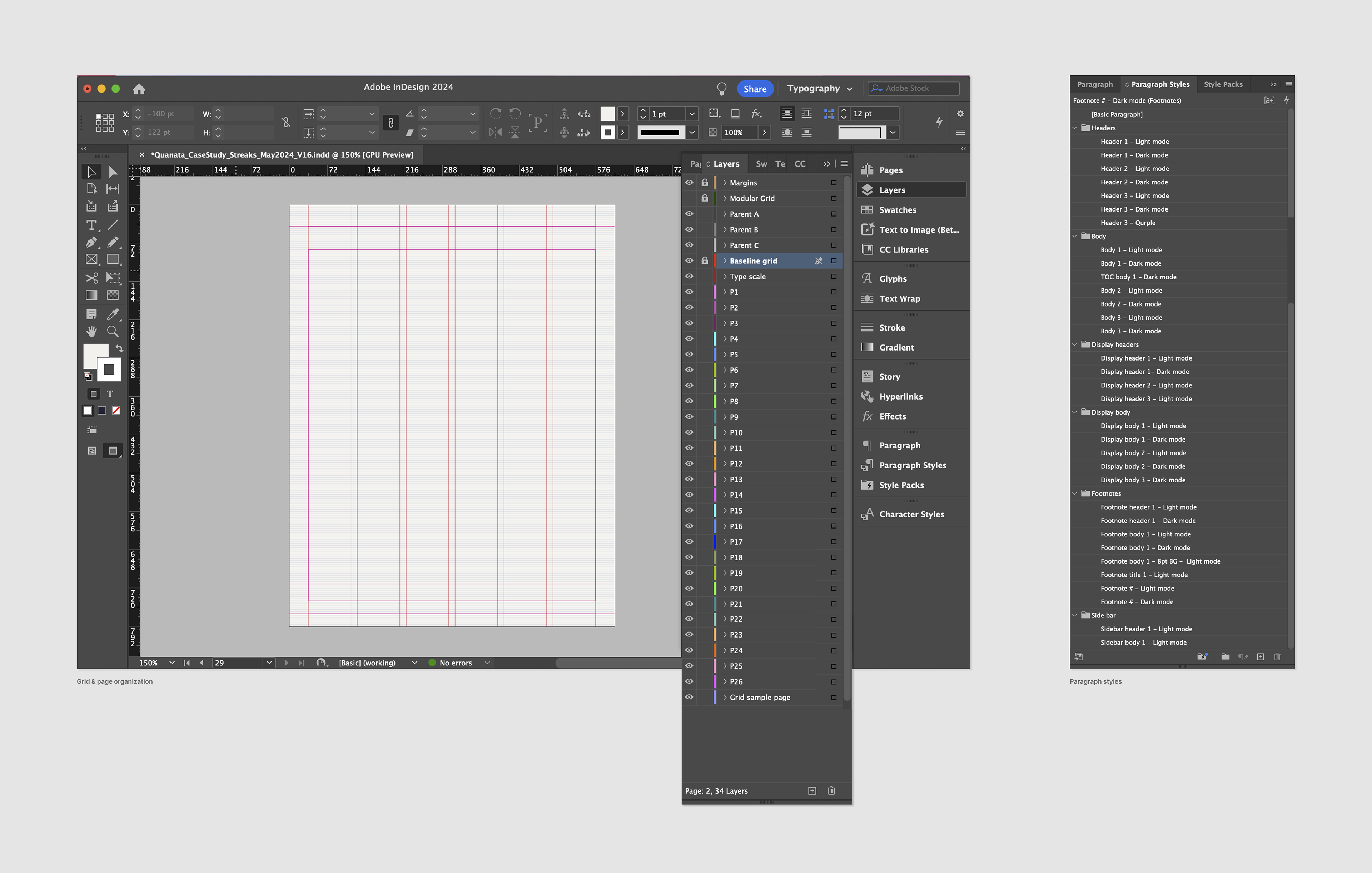
InDesign file creation
In more detail, my responsibilities in converting our visual Figma designs to Indesign also included the Indesign file creation, page organization, paragraph and grid style creation, page and image layering and labeling, master page creation and application, document packaging and output, and any and all edits or updates. I also created a new template based off this case study with all page layouts, type and grid styles, and master pages prepped for future Quanata case studies or needs.
InDesign file displaying file layers & paragraph styles
LinkedIn & Blog

Microsite mockup
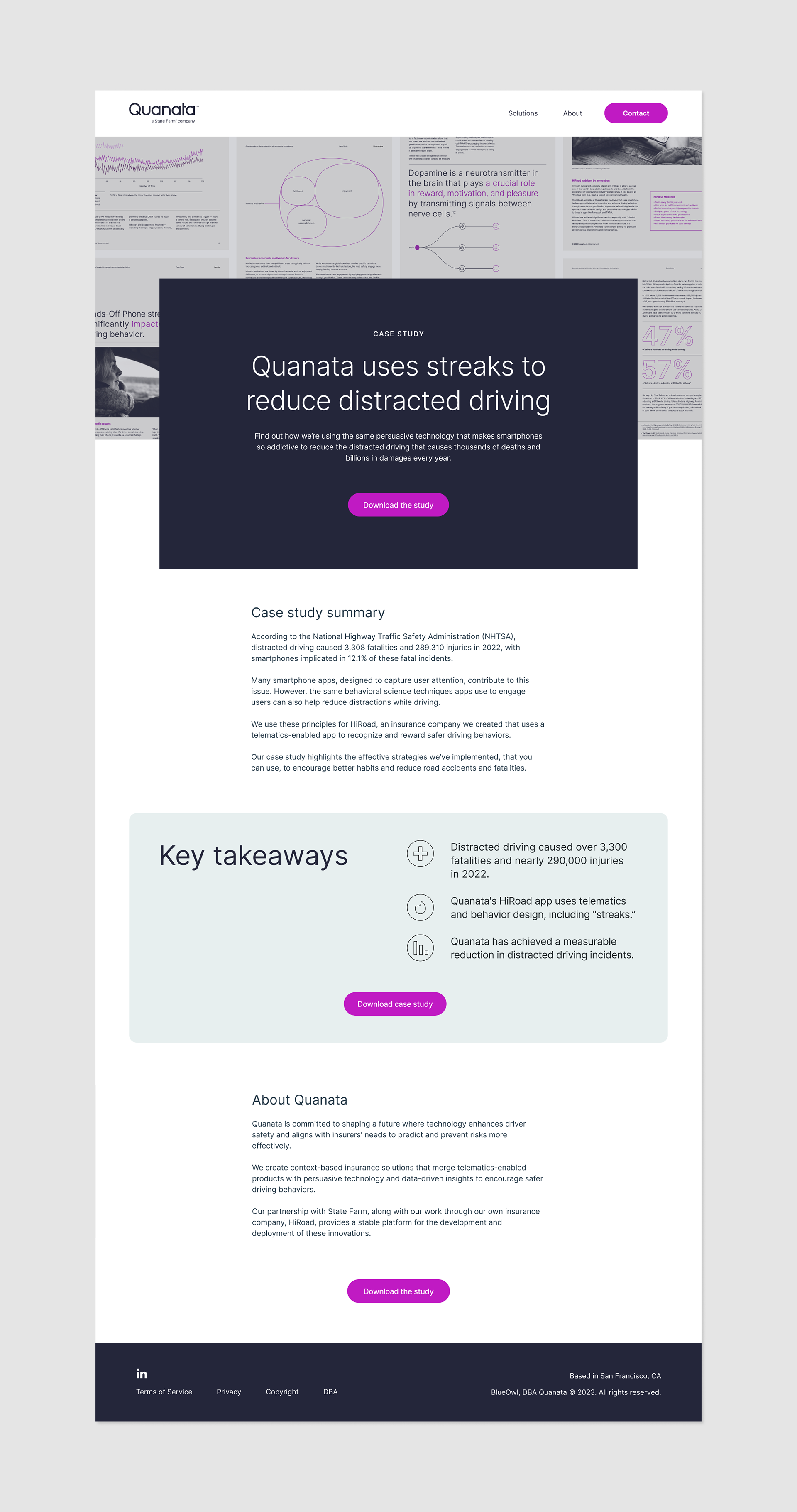
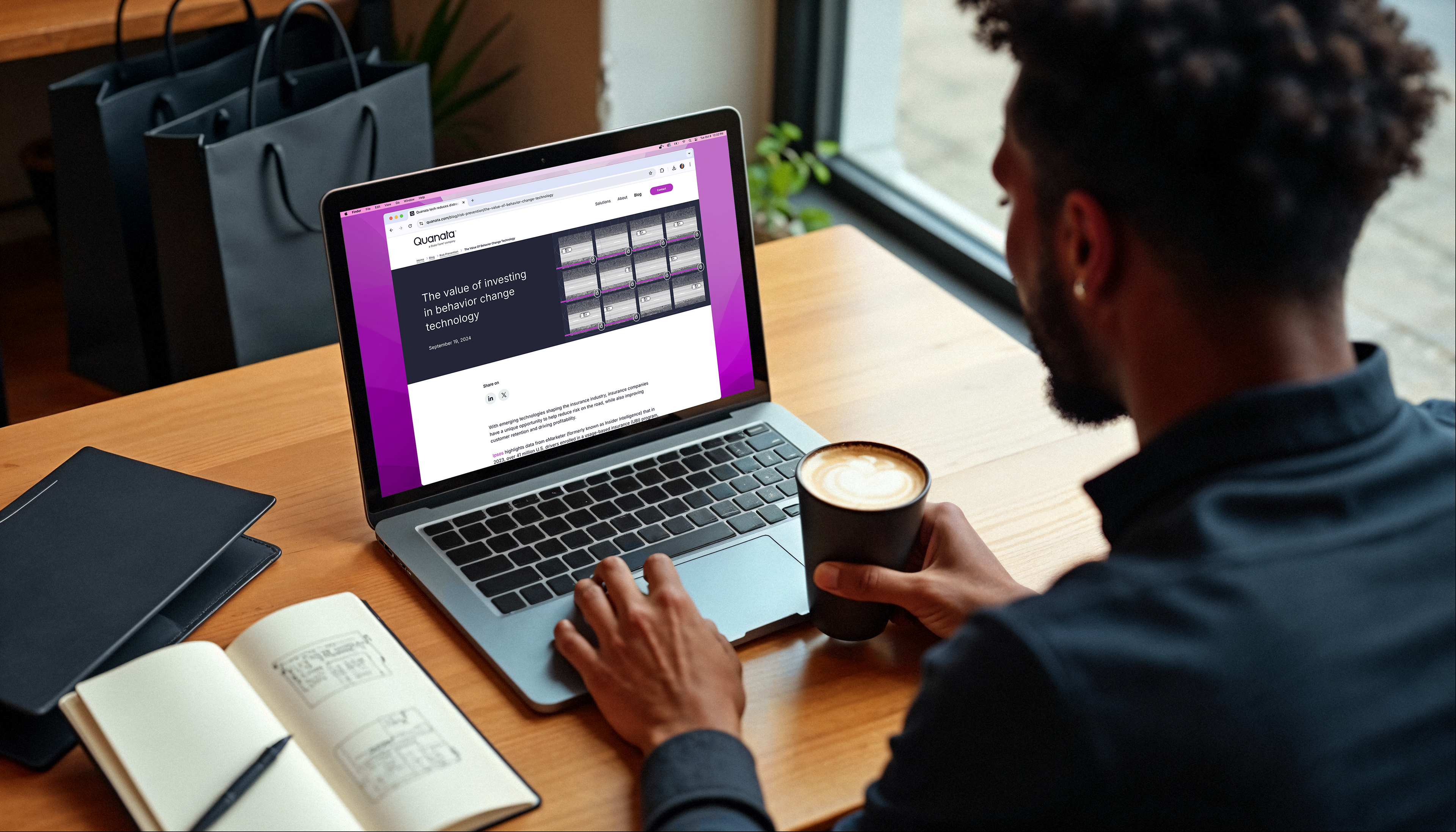
Microsite
The microsite, launched in September 2024, offered clients and readers an overview of the case study with a download option, and was promoted through social media and client outreach. I designed the UI and mockups using rough modules from our design system as a starting point. I customized those modules and key elements to better suit our needs and collaborated with engineering to execute the final product by providing mockups, assets, a type scale, and pixel dimensions.