Oh Katie Q. Jewellery
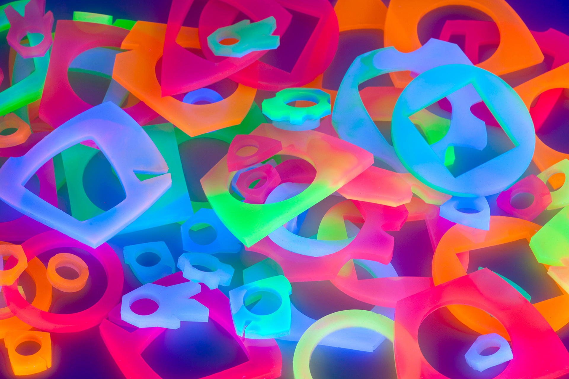
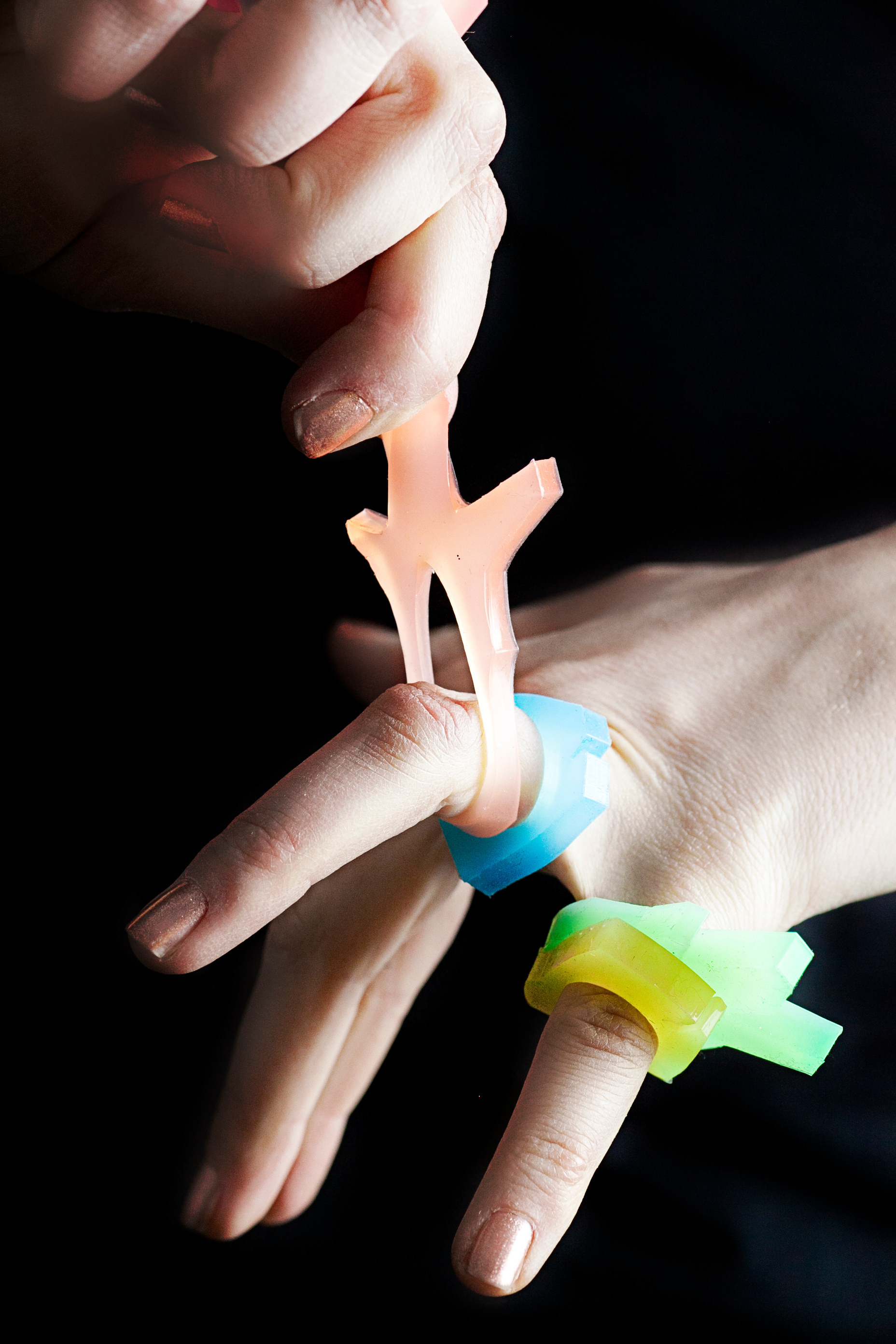
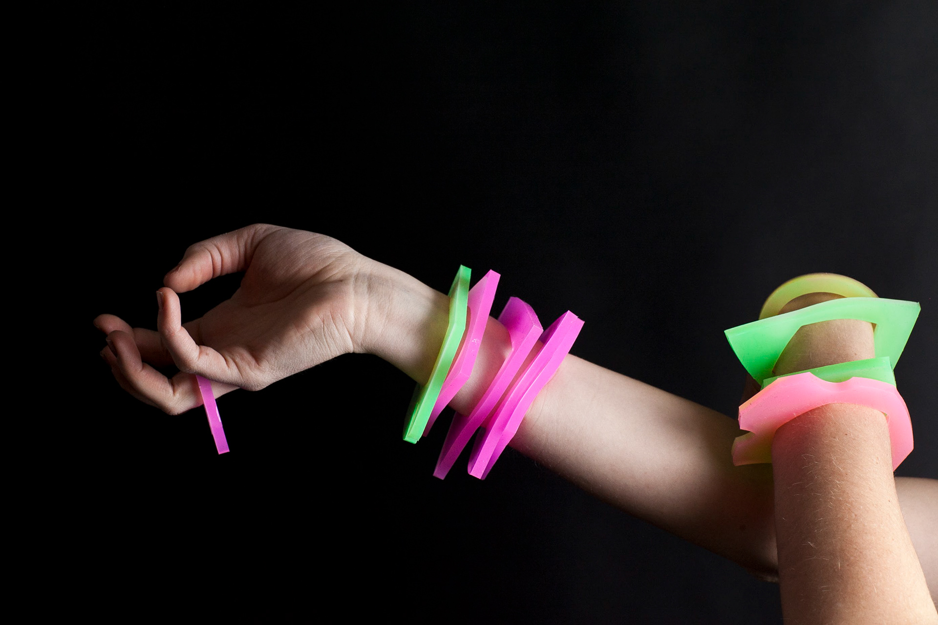
Oh Katie Q. Jewellery is an artisan jewellery company based in Toronto, Canada that focuses on promoting active participation, creative expression, and conscious integration of play into our daily lives through one of a kind silicone jewellery. This unique handmade organic and geometric shaped jewellery is made from a specialty silicone, which has the ability to stretch, twist, and withstand aggressive pull; like a rubber band, silicone also has the useful property of returning to its original shape when released from tension. Its texture is smooth, yet squishy and each piece has been uniquely dyed with ultraviolet pigments (black light dye) and glow in the dark dyes to create a whole new multi-sensory experience. Through the elements of elasticity, texture, and color, these pieces steal the spotlight.

Product Research
Oh Katie Q. Jewellery was launched in 2012 as an extension of the founders thesis project, which revolved around conscious play and its benefits in our everyday life. The focus during her thesis exploration was learning more about the effects of sensory play (touch, smell, sight, etc) and how it affects personalties, attitudes, and experiences. There is a strong documented correlation between sensory play and brain development, social interaction, language development, cognitive growth, fine and gross motor skills, problem solving, anxiety, and focus. As a Material Art & Design student Katie was particularly interested in exploring the tactile side of these theories.
Product Exploration & Production
Through research and experimentation with new interactive materials and a custom production technique, the goal of Katie's exploration and study was to learn more about the effects of sensory play between an object and a user. She wanted to stimulate the senses, through touch and sight, and allow the user an open outlet to react instinctively.
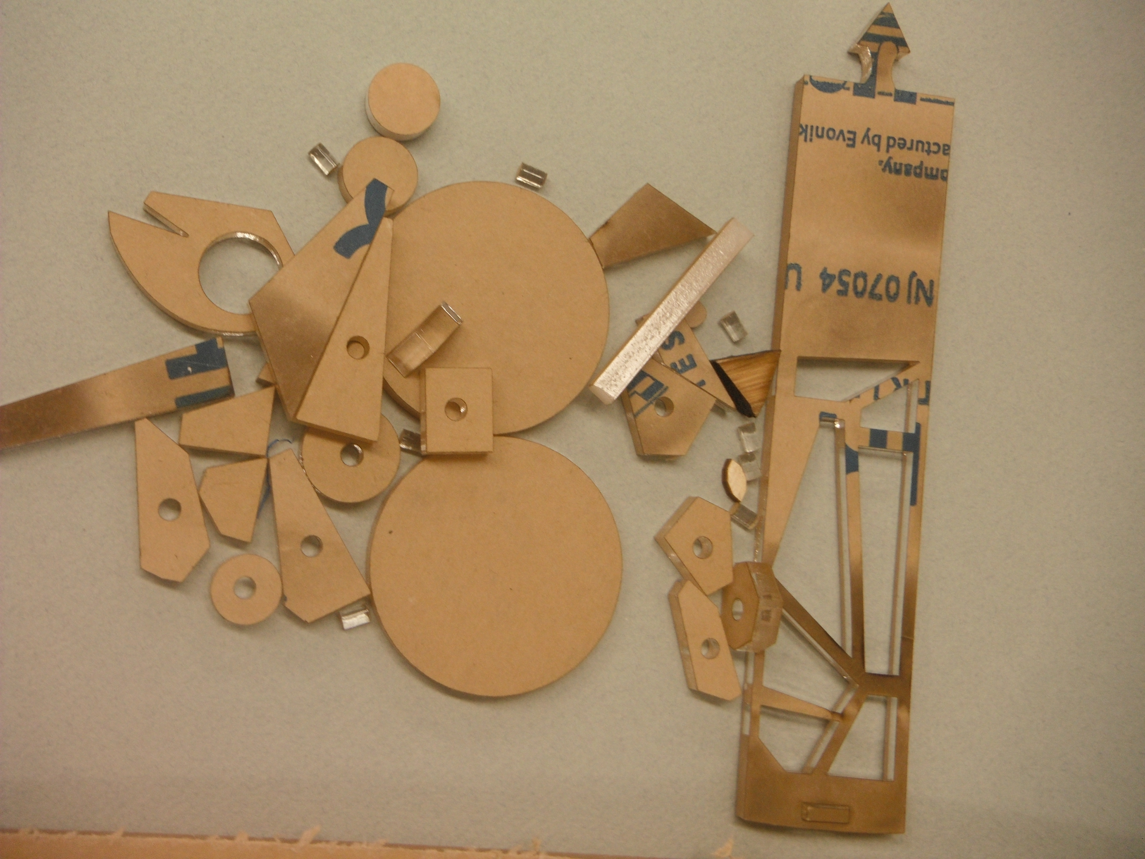
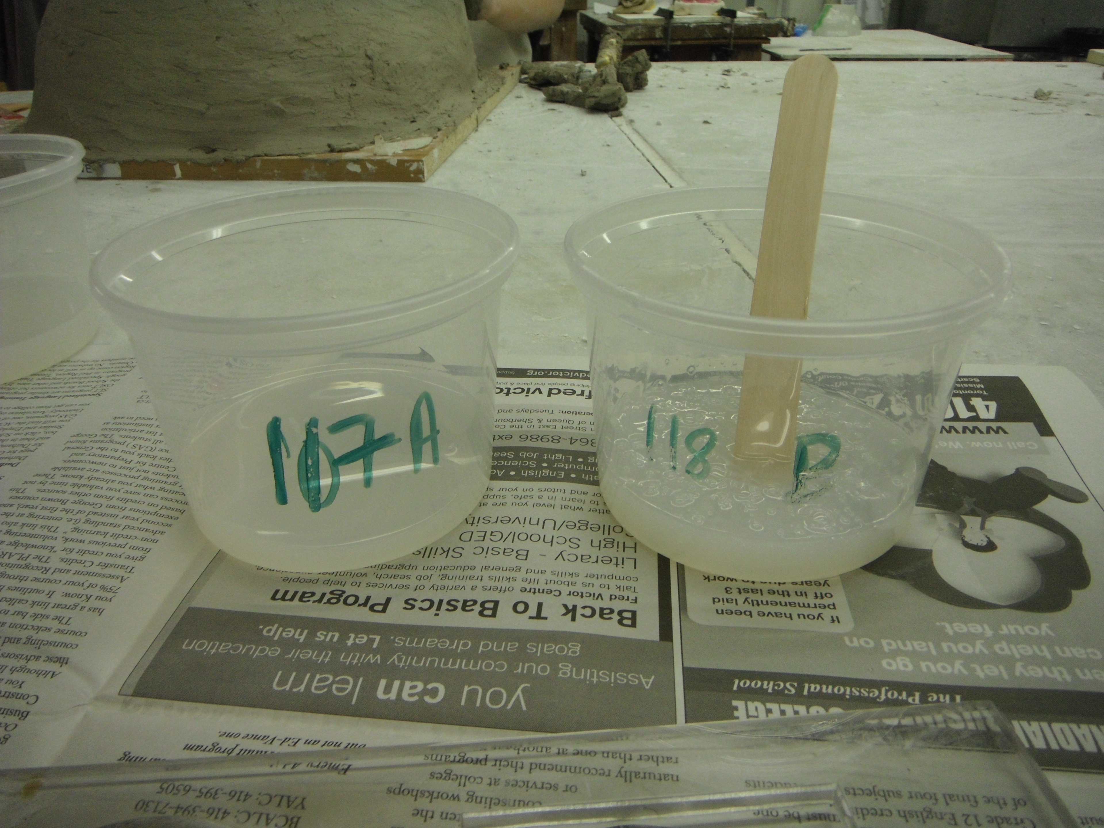
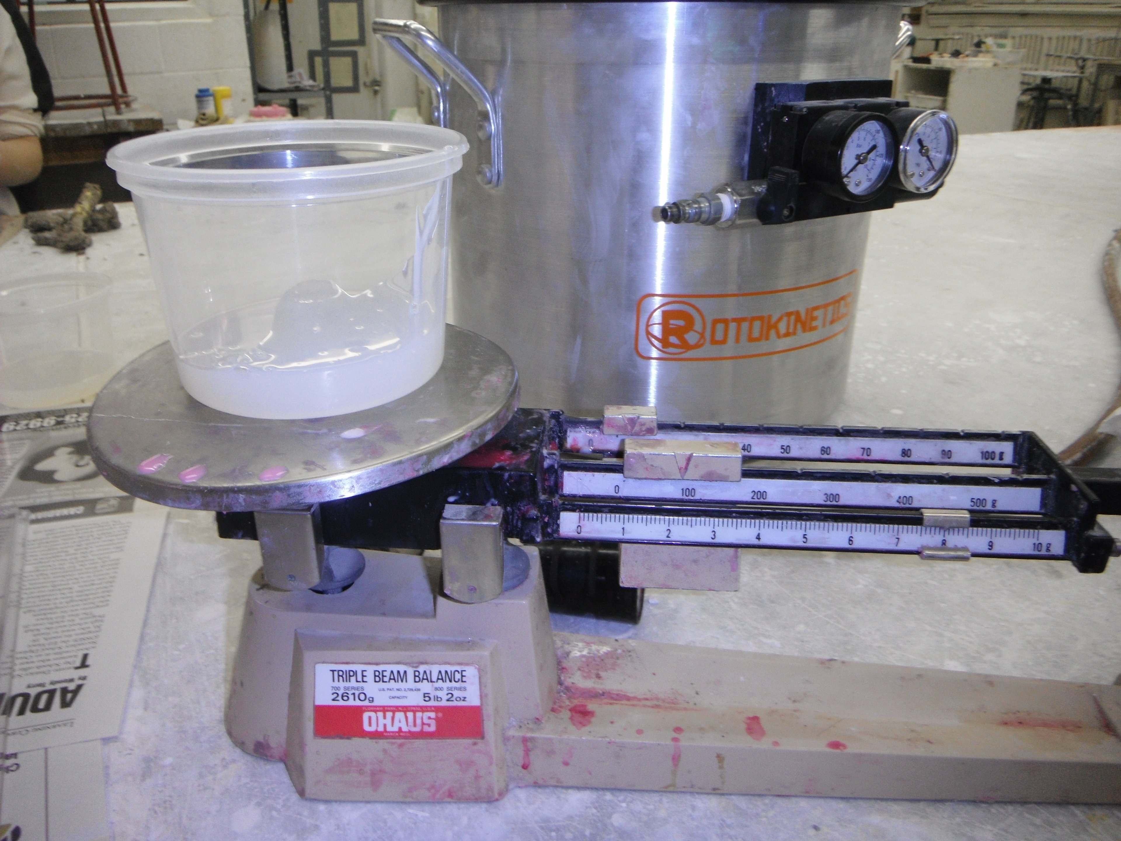
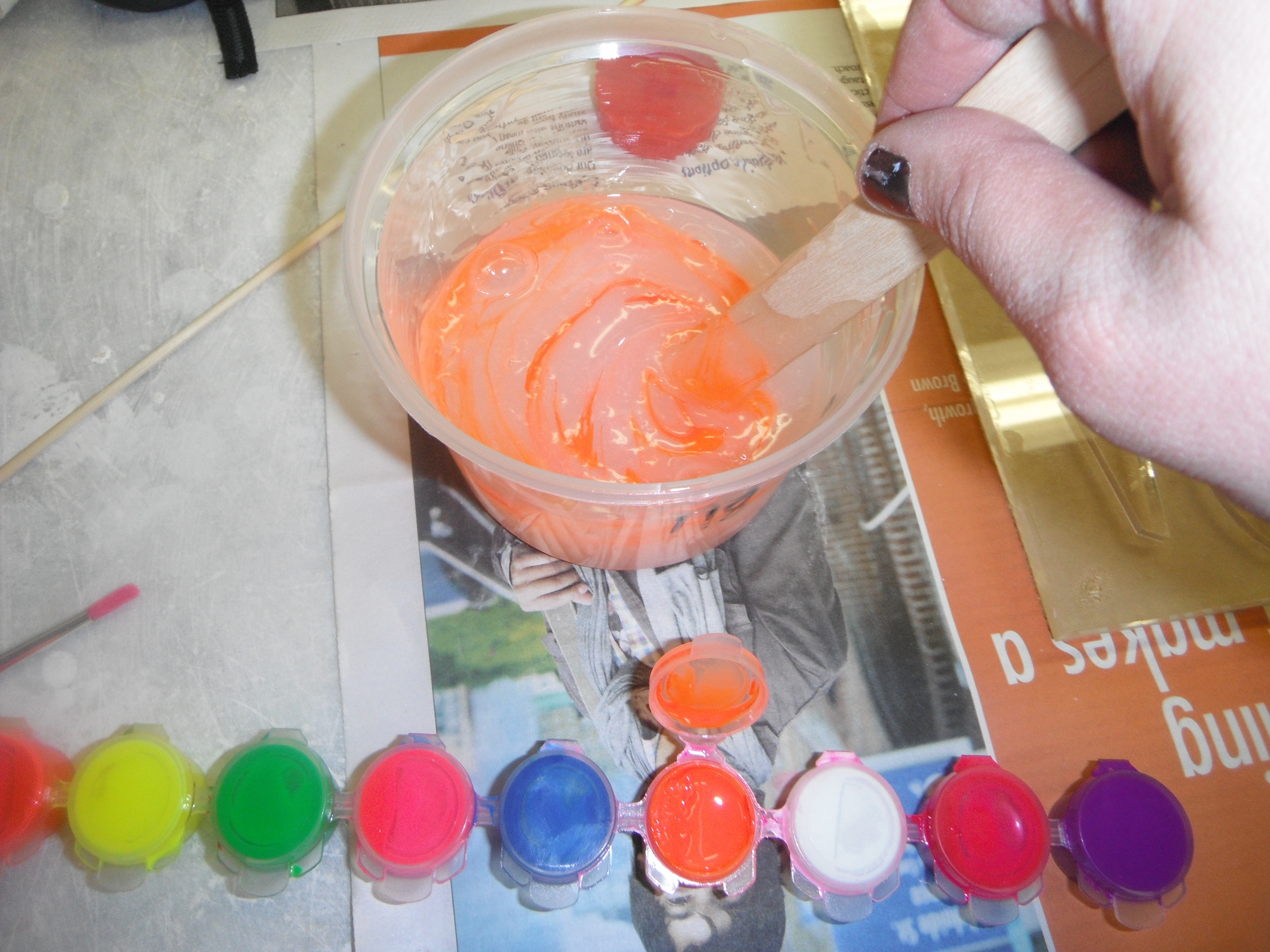
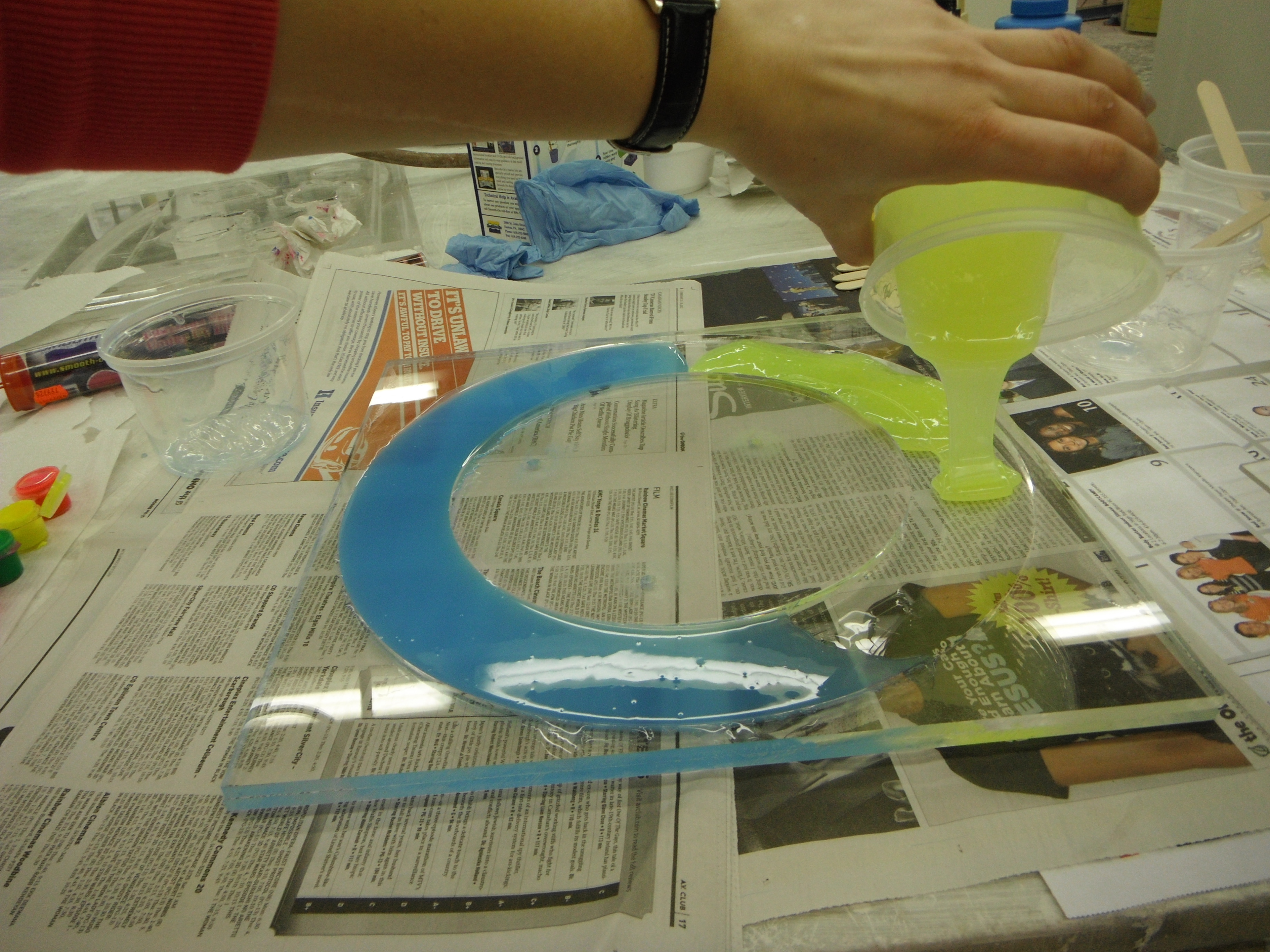
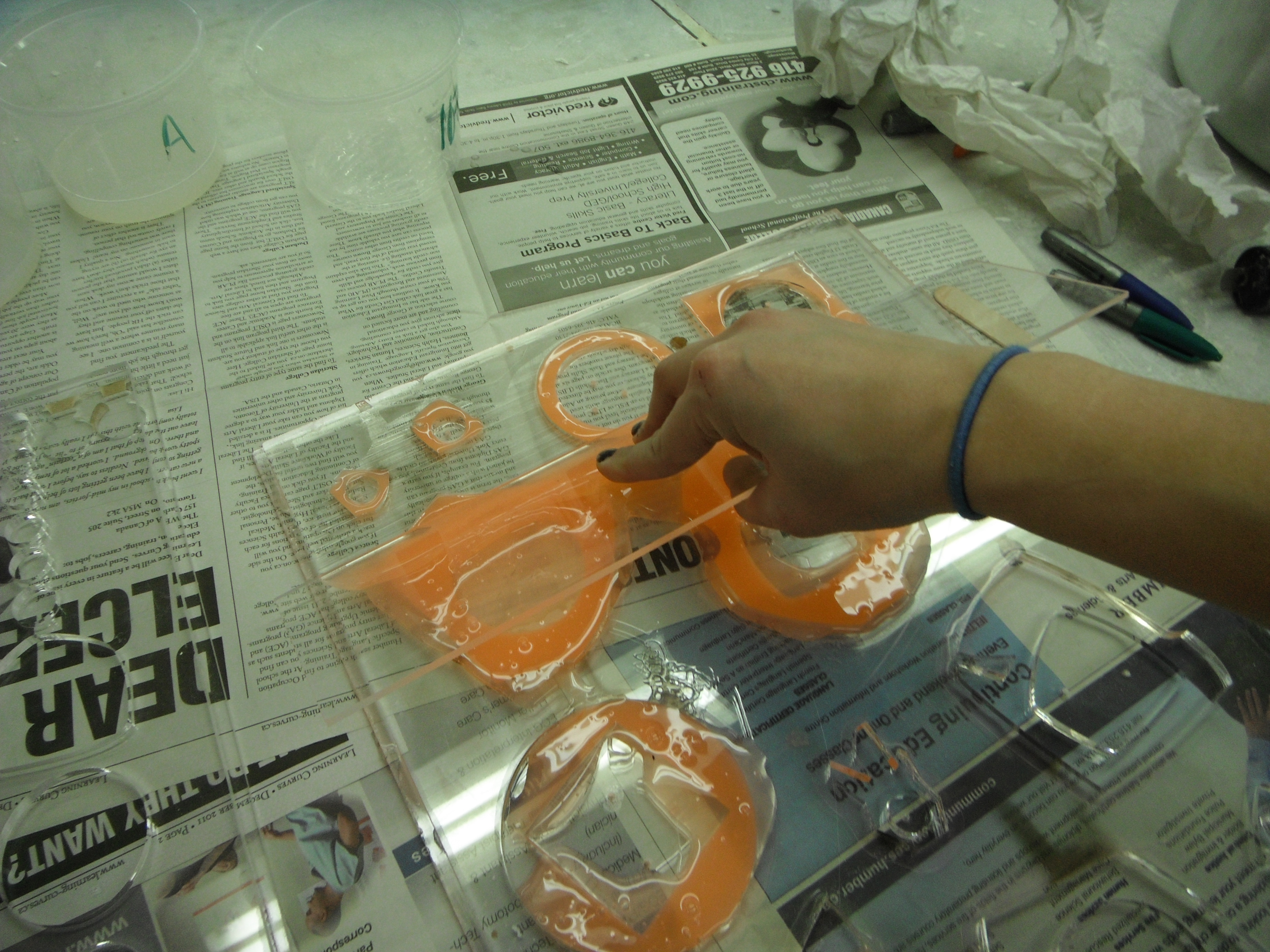
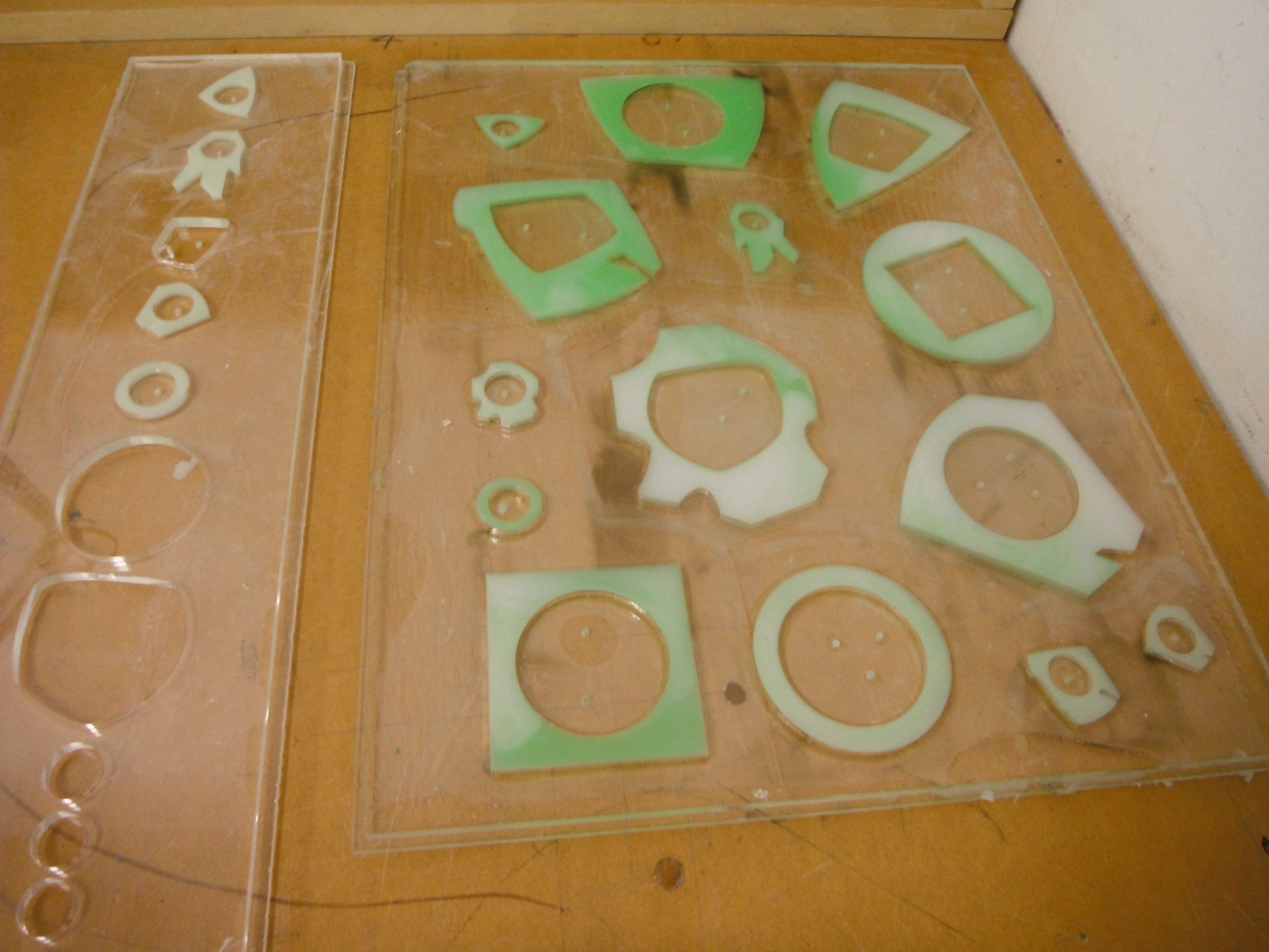
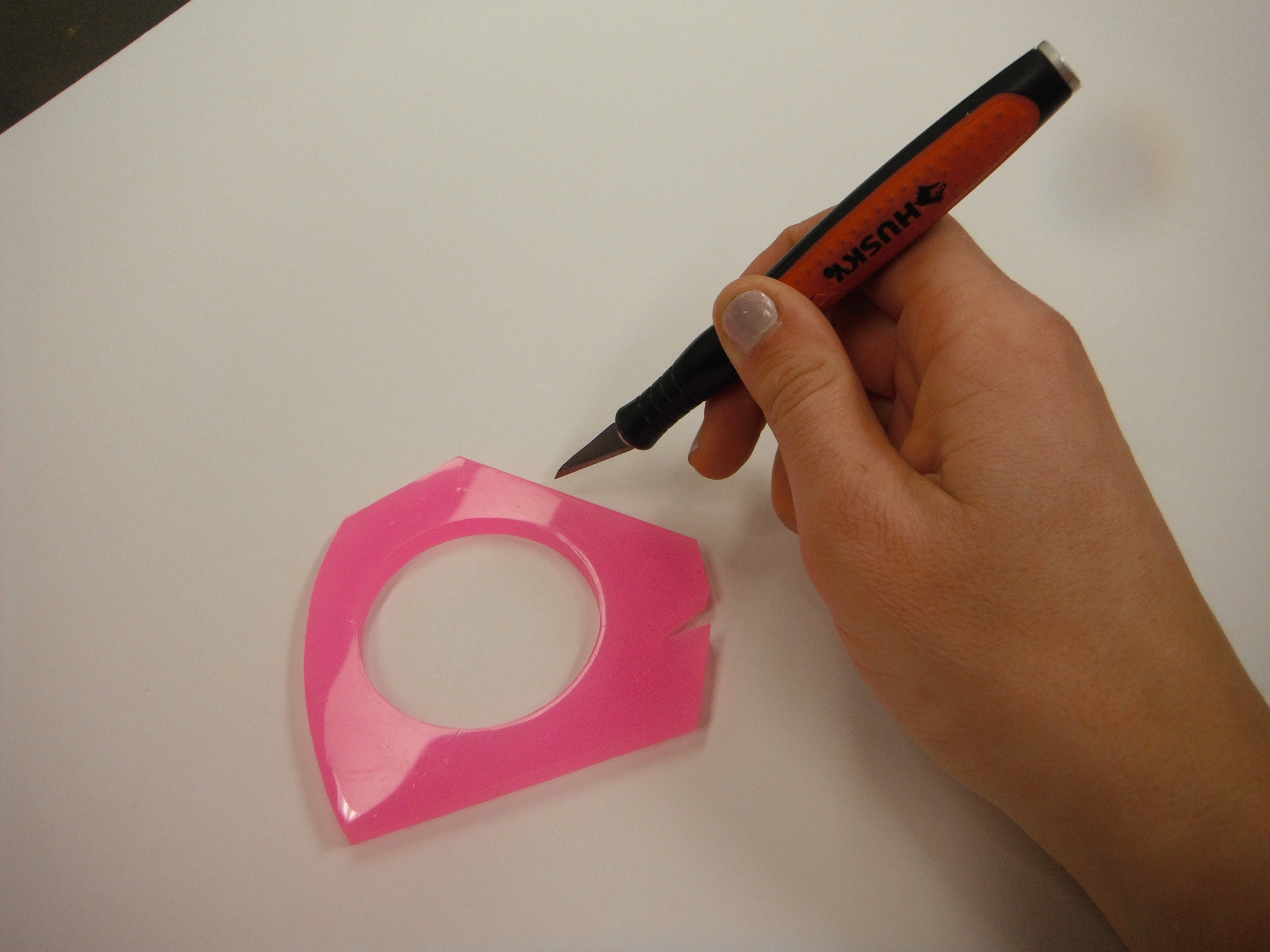
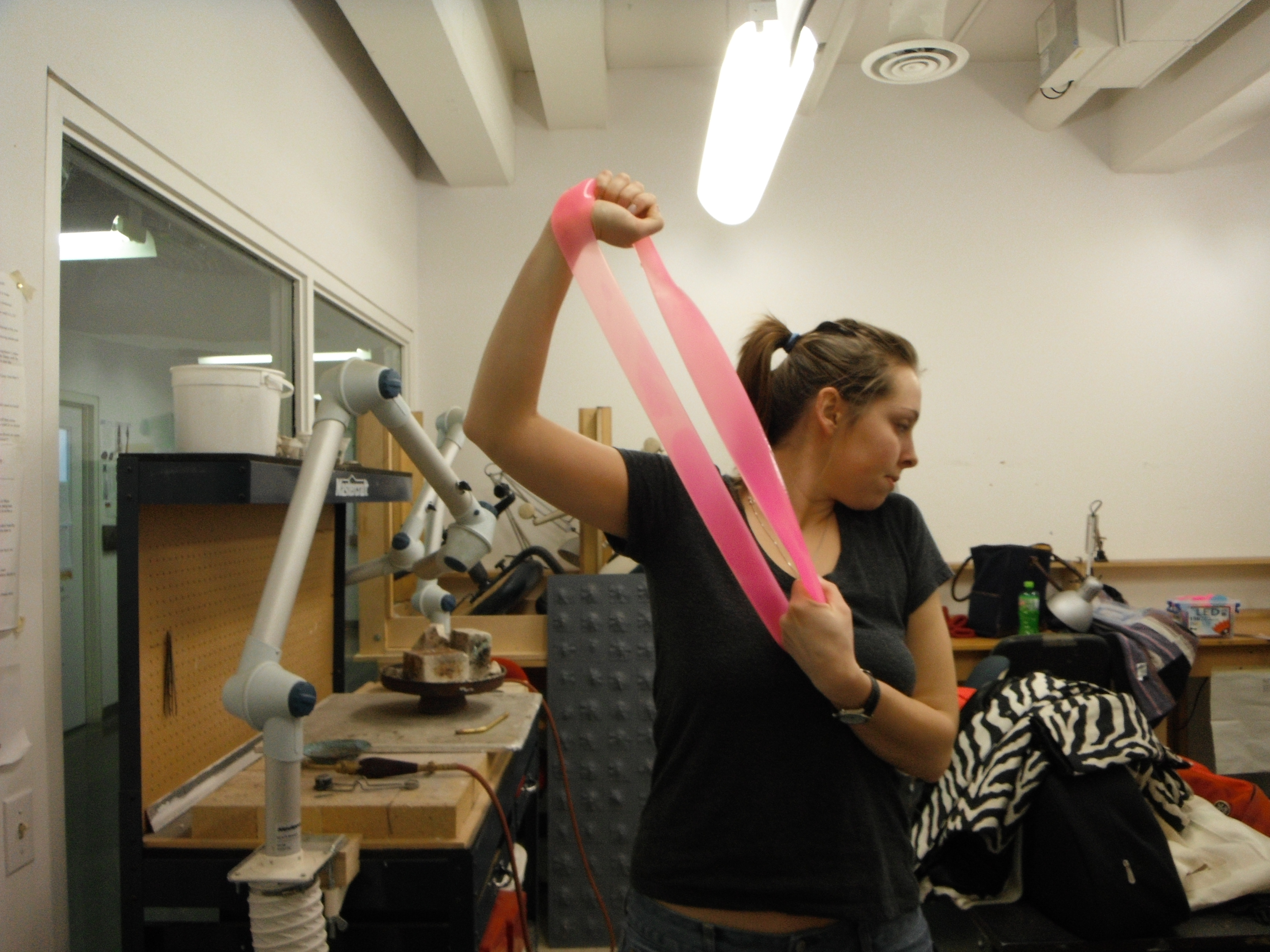
Starting her experimentation Katie explored all manner of textured materials that provoked the senses, either visually or tactilely, including textured papers, plastics, silicones, rubbers, glass, metal, fabrics, clay, and more. She eventually discovered a sub-type of silicone that held unique properties and colorations that could be used to stimulate activity/interaction and individualized responses between the user and object. Katie decided the best form for these objects would be jewellery as she could create something visually interesting as well as physically alluring. Her final designs would be in the form of bracelets and rings that engaged a bright color palette and abstract shapes to allow users freedom to their imagination.
Katie proceeded to design and develop models and molds, practiced new production techniques, defined material measurements and time requirements, implemented new tools, and kept detailed documentation. The final product design was showcased during an open house exhibition with hundreds of attendees. The overall response was positively hypnotic and emotional. Each user was completely captured in the moment when playing with these jewellery pieces and were eager to share their feelings and experience with others around them. From laughter to surprise to nostalgia users had a hard time disengaging.
Design Challenge
The company's original product offering was a small sample of rings and bracelets, which quickly expanded to a larger product offering of rings and bracelets as well as necklaces, and keychains. The name Oh Katie Q. Jewellery was a play on the creators name and the CCR song "Suzie Q". As Oh Katie Q. Jewellery started to enter the retail market they needed a brand identity to introduce themselves and capture the spirit and voice of their product and company.
Design Solution
The solution started with in-depth brand analysis and competitive research to better understand the current market and how Oh Katie Q. Jewellery would excel in it. During the design thinking process, I developed a flexible and distinctive brand identity system to express the brand's new personality.
Results
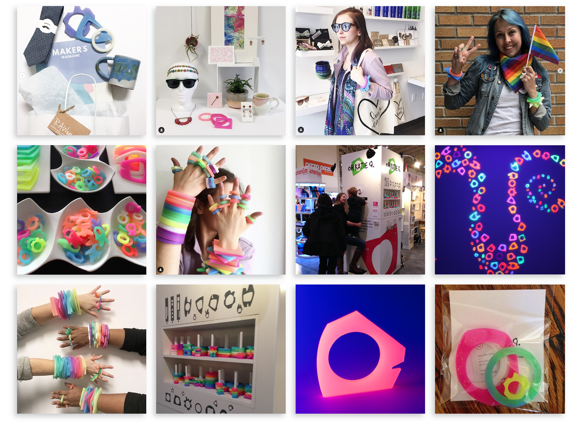
• Featured product in T.I.F.F Bell Lightbox market. Known around the world for the TIFF International Film Festival.
• Product featured in several boutiques throughout Toronto.
• Oh Katie Q. Jewellery was invited multiple years to participate in Toronto's One of a Kind Show, one of the largest and best-attended craft shows in North America. Voted Rising Star and interviewed by the CBC (Canadian Broadcasting Corporation).
• Invited to participate year over year in a series of Toronto summer exhibitions.
Scope of Work
Brand Research & Strategy
Brand Identity System
Website & Marketing Assets
Brand Identity System
Website & Marketing Assets
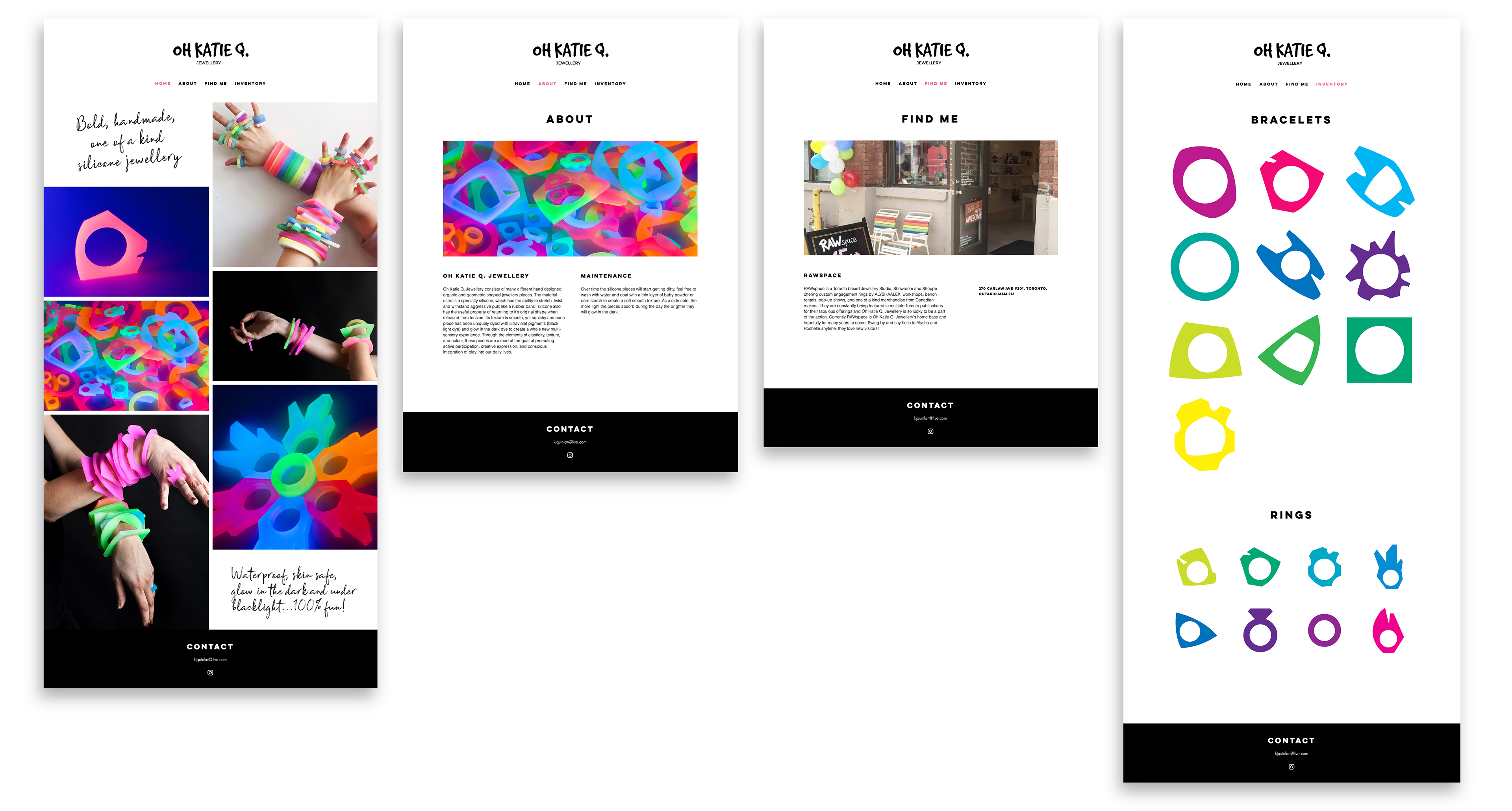
Website
www.ohkatieq.com
Year
2012
Defining the Brand
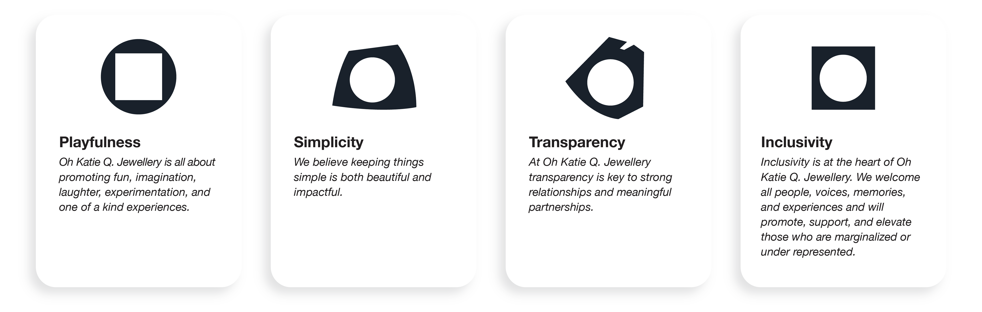
Through a series of exercises in the empathize stage, we extracted and refined the brand attributes. The brand attributes set the foundation for positioning the brand and creating the identity.
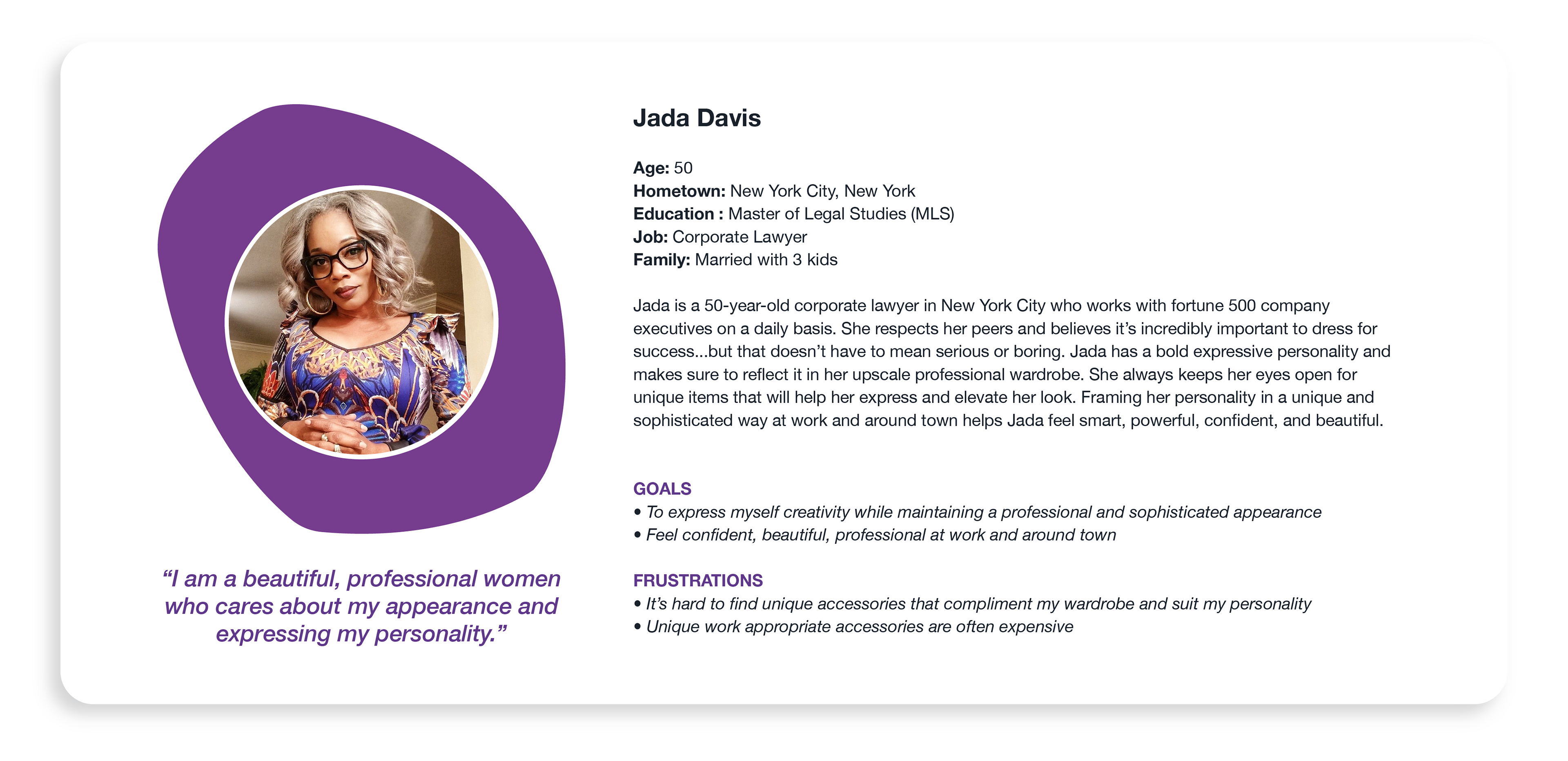
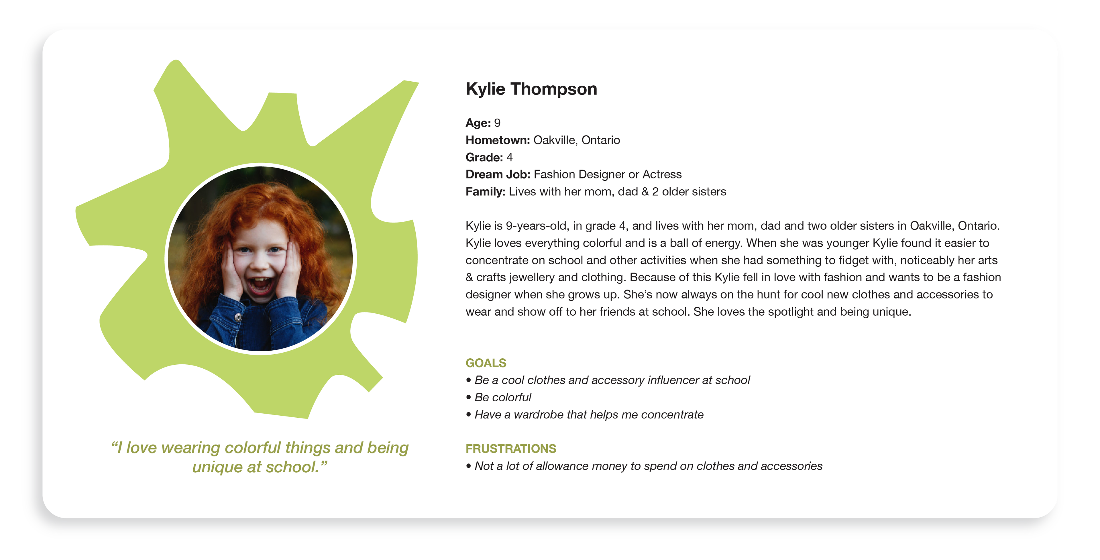
Understanding the Customer
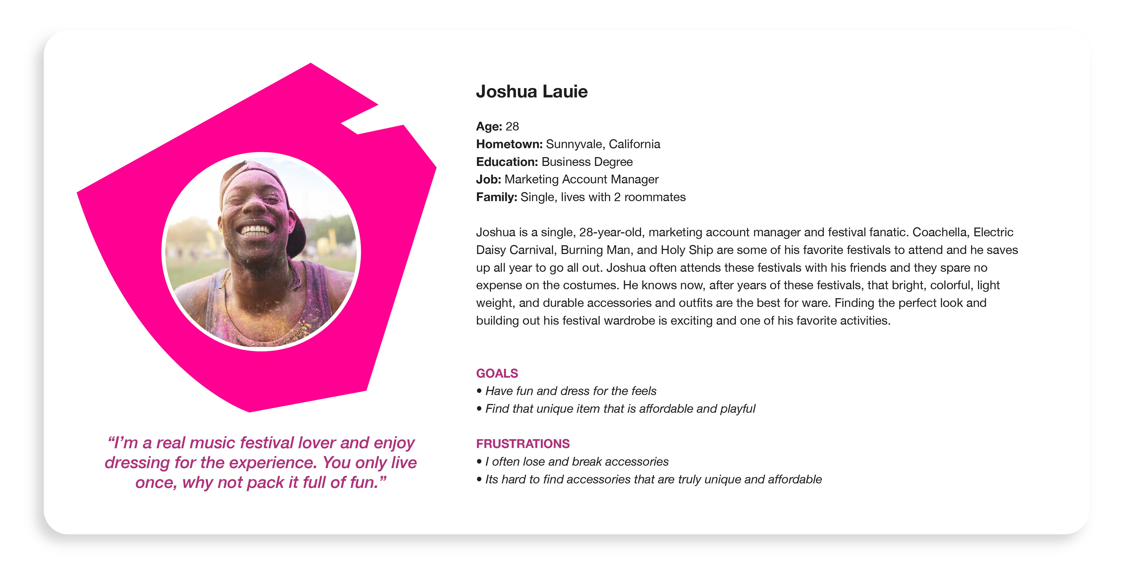
Oh Katie Q.'s mission is to evoke happiness, exploration, and play into our daily lives while also creating a unique outlet for personal expression. To understand the needs of Oh Katie Q.'s customers, I created user personas based off customer feedback and conversations from trade shows and events to help paint a clear picture of our customers unique stories, demographics, pain points, and desires.
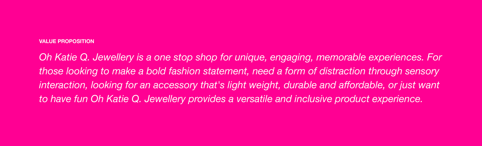
Positioning the brand
Through conversation, brand exercises, and user research, I crafted the value proposition.
Creating the Identity System
In order to stand out and make a visual impact in the market Oh Katie Q. Jewellery needed a strong and distinctive identity that conveyed its playful personality and unique spirit. We did this by defining a strong logo, colour palette, typography, and supporting visual assets.
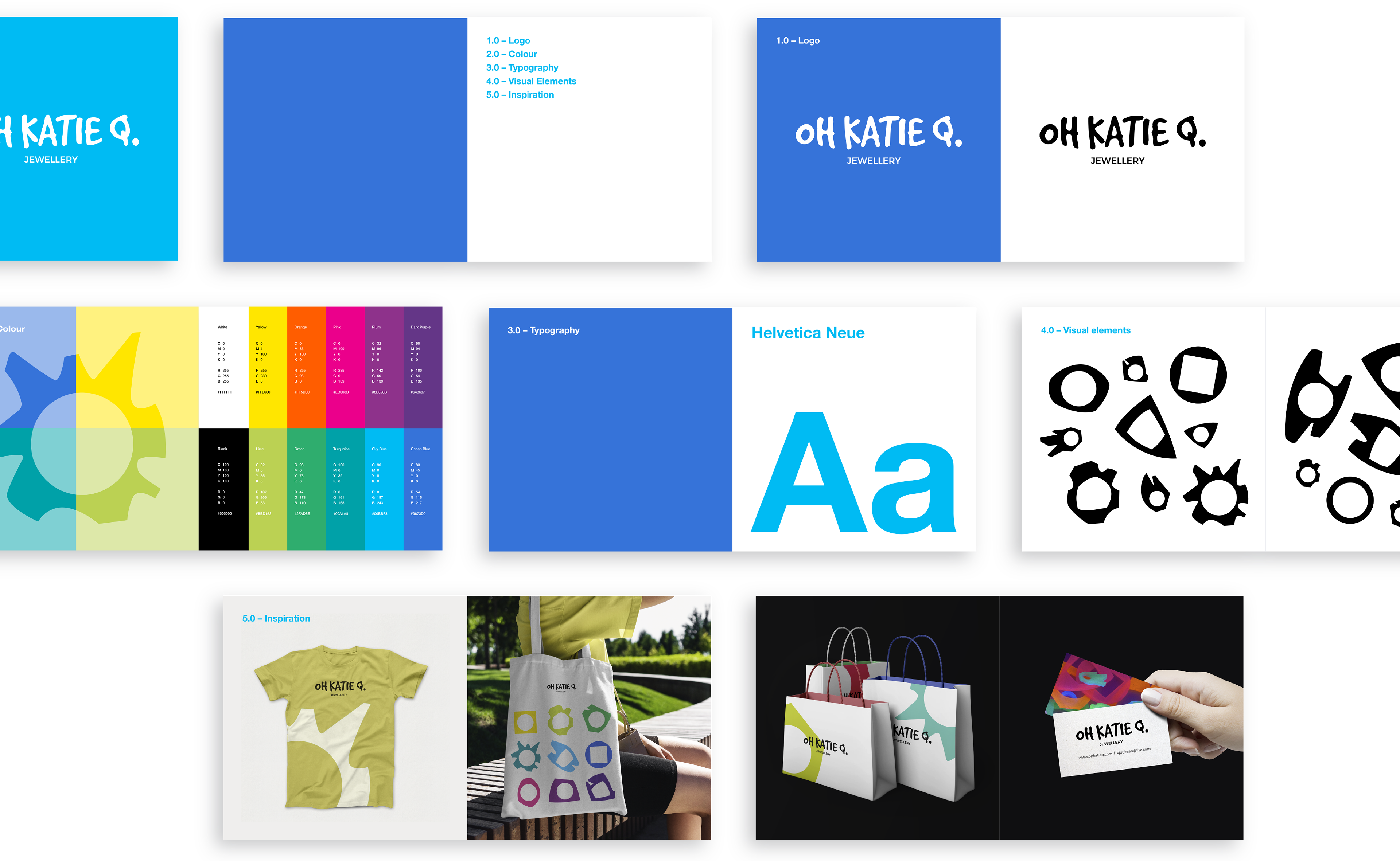
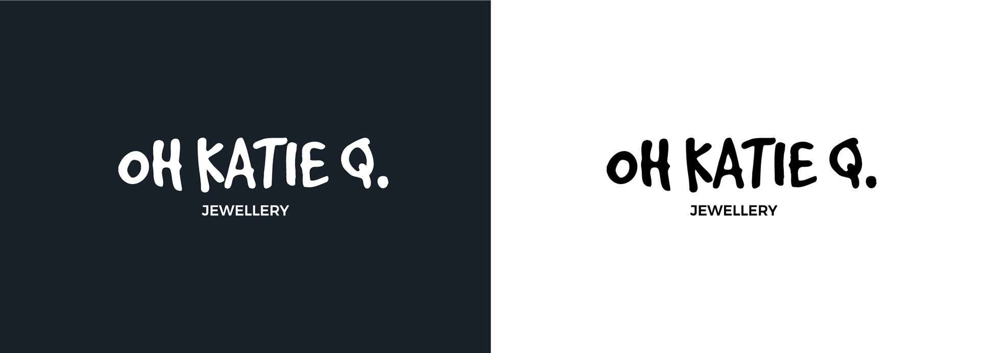
Logo
The Oh Katie Q. Jewellery logo is simple, distinctive and unique, which makes it memorable. To emphasis Oh Katie Q's brand attributes and attitude I explored quirky, expressive display typefaces as well as clean, bold, approachable sans serif typefaces to contrast and complement each other.
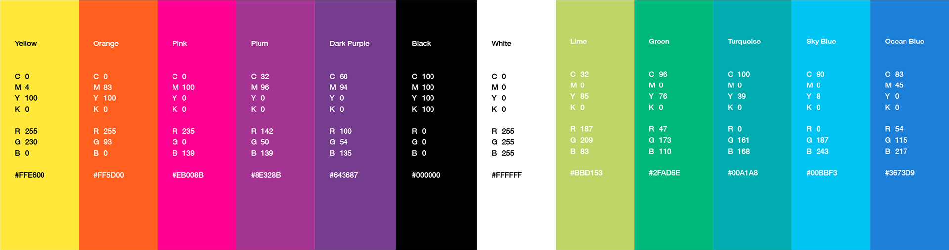
Color palette
I created a color palette for Oh Katie Q. Jewellery that is approachable, diverse and energetic. As the jewellery is spontaneous and interchangeable in sets so can the palette be. Together these colours compliment each other and create a powerful brand personality.
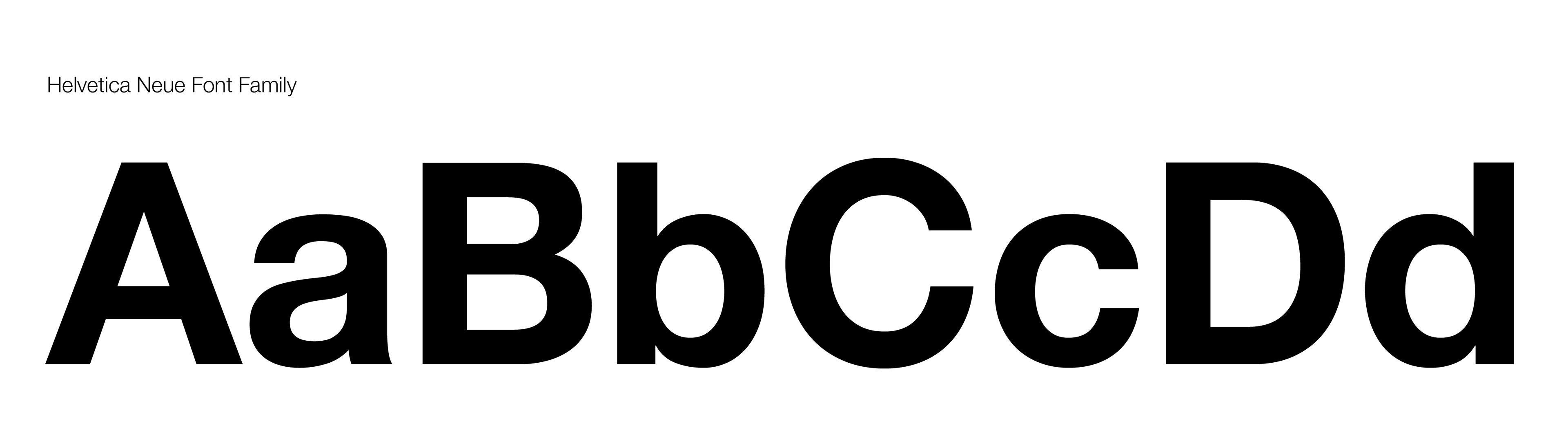
Typeface
Oh Katie Q. Jewellery needed a brand font that would compliment the logo and express the brand's personality – one that is modern, approachable and flexible enough to fit a wide range of visual communications. Because of its versatility and approachable letterforms, I chose Helvetica Neue to represent the brand in marketing and brand collateral.
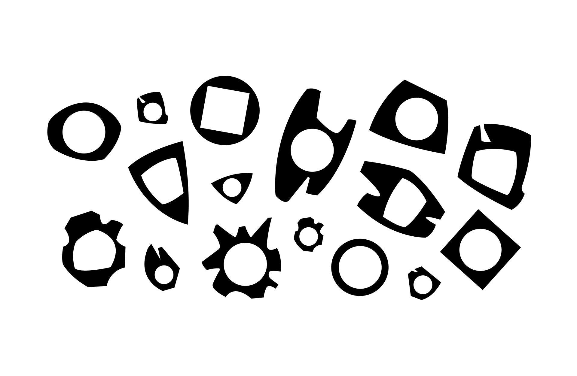
Extending the brand identity
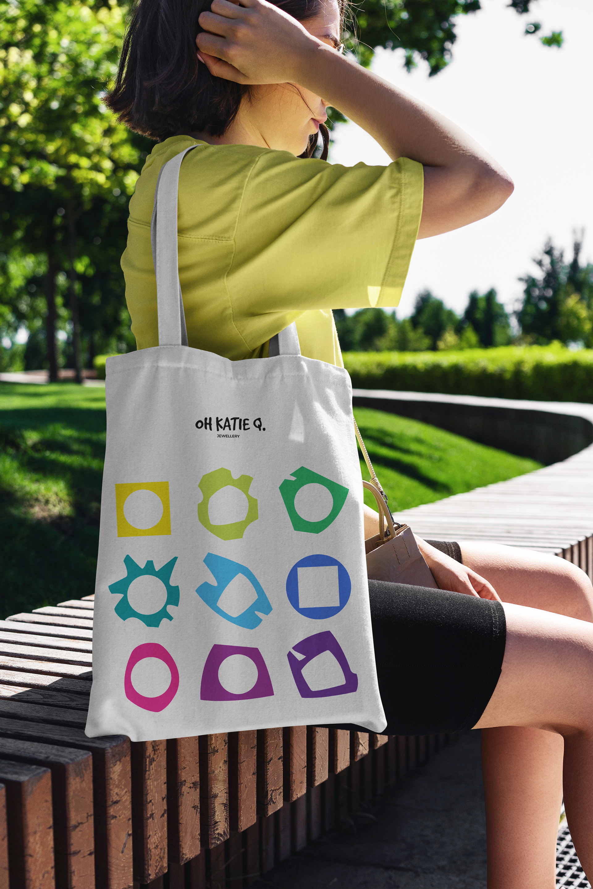
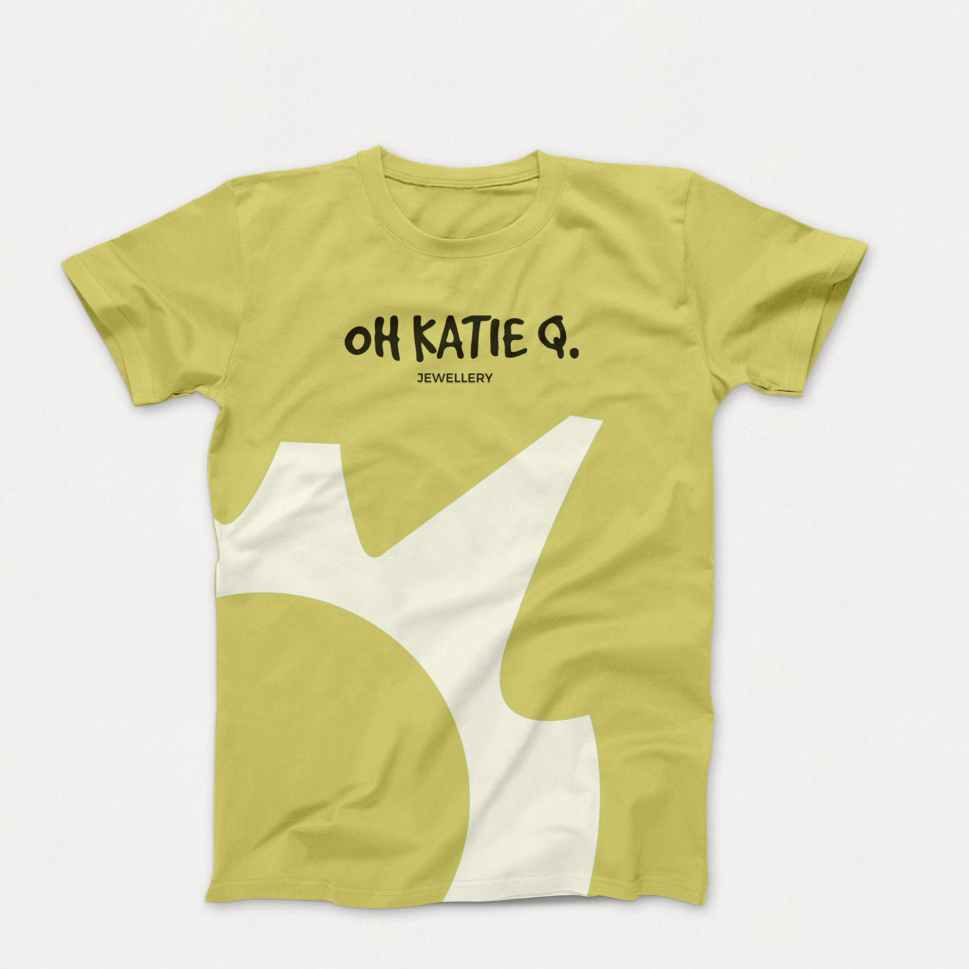
In addition to photography I integrated the outlined shapes of Oh Katie Q's jewellery pieces as visual accents and icons into the brands visual language to further promote brand recognition and incorporate some Oh Katie Q. energy.
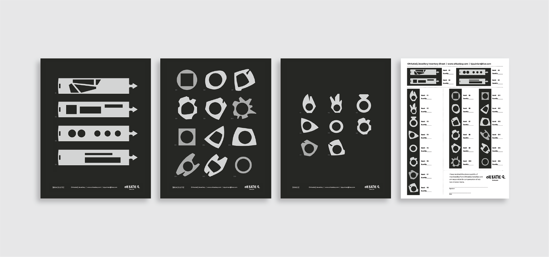
Product List & Inventory Sheet
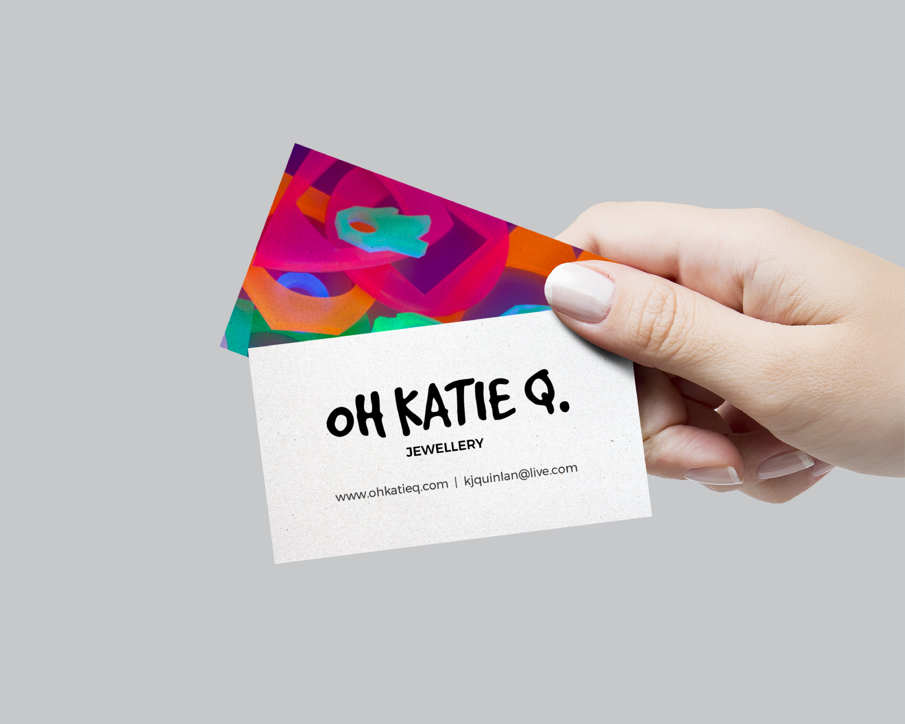
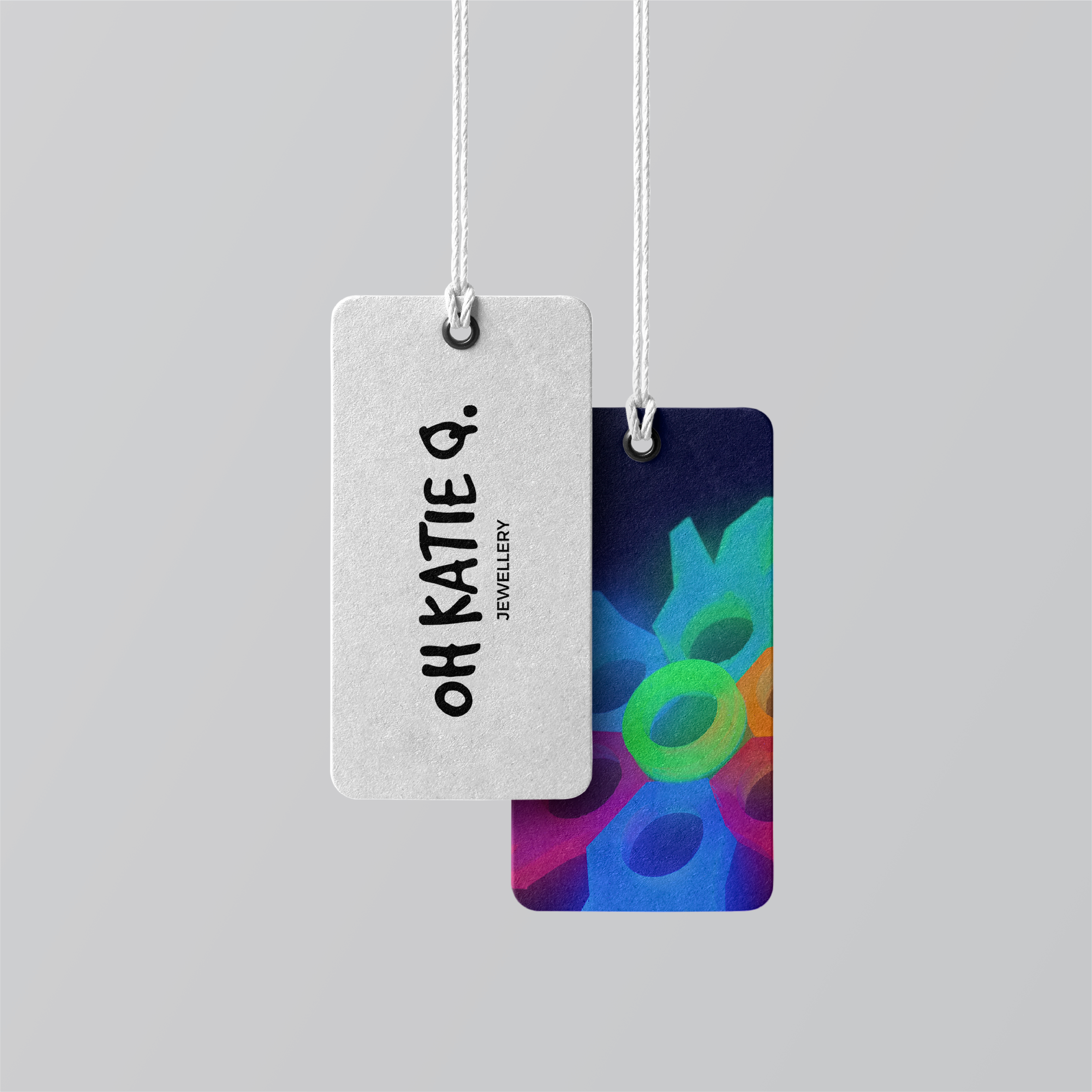
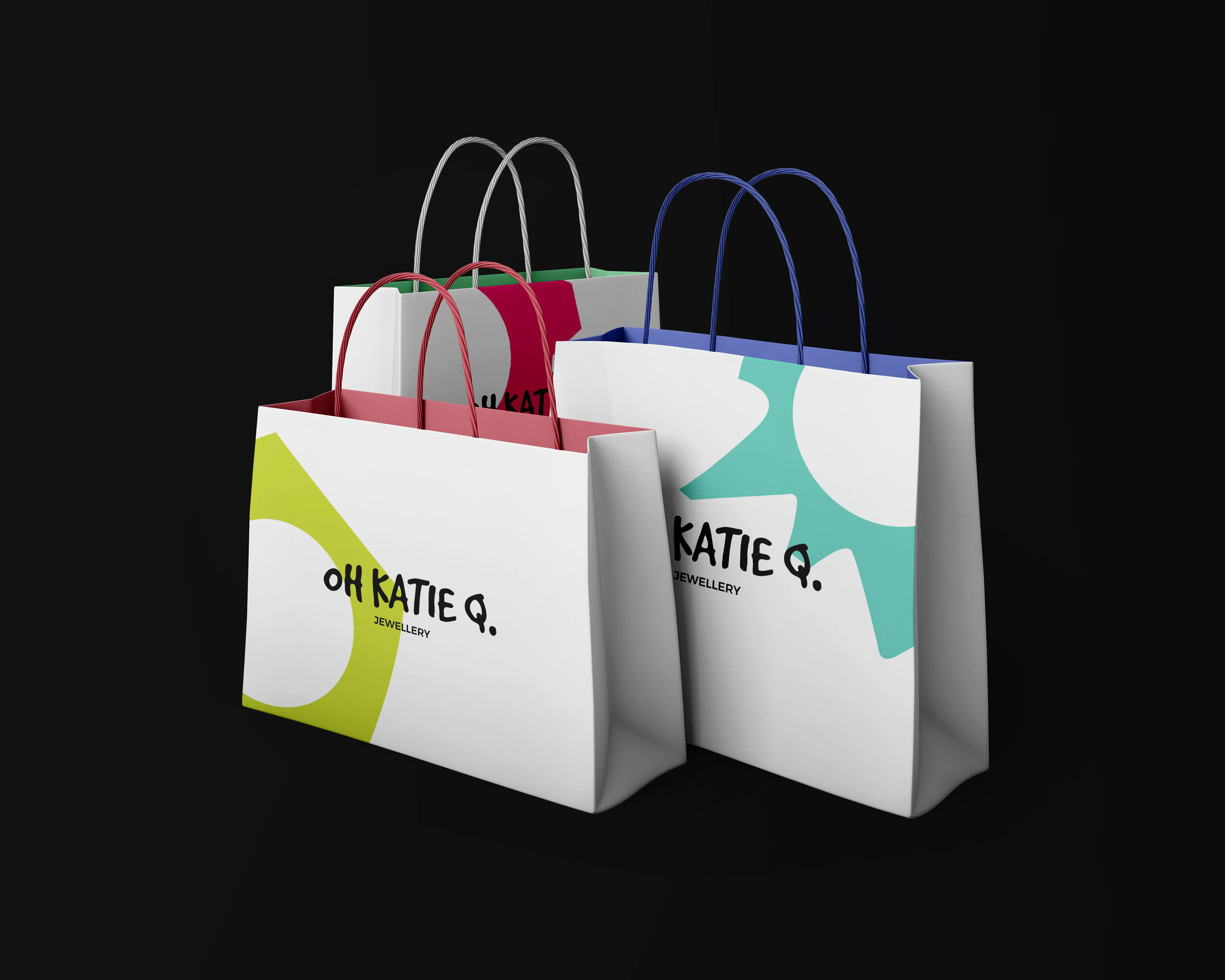
Packaging & Swag
Website
Instagram