
HiRoad Brand Guidelines
Who is HiRoad?
HiRoad is a behavior-based auto insurance provider that rewards customers for mindful driving. By using their app, drivers can lower their monthly rates based on how well and how often they drive.
Project Overview
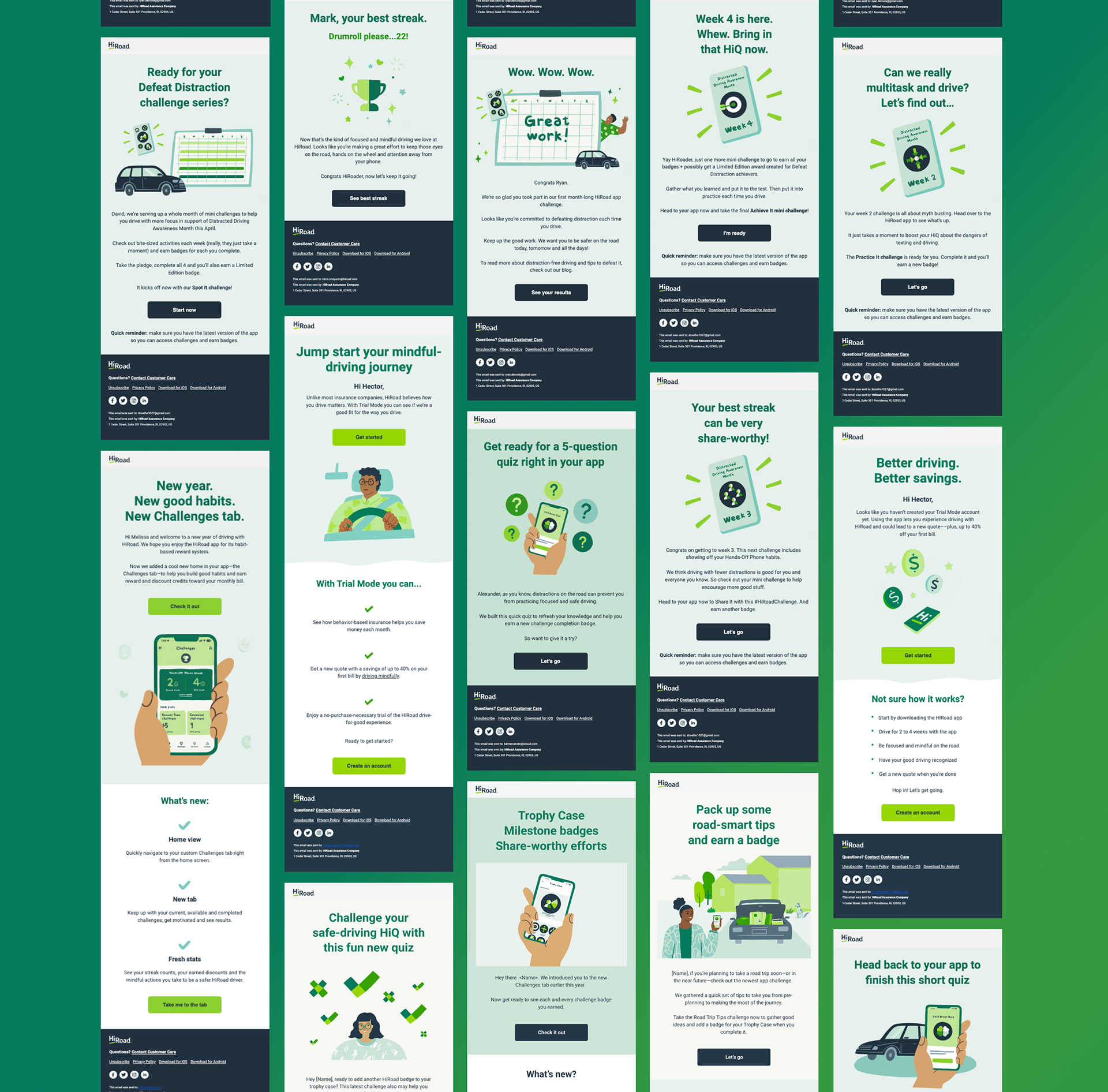
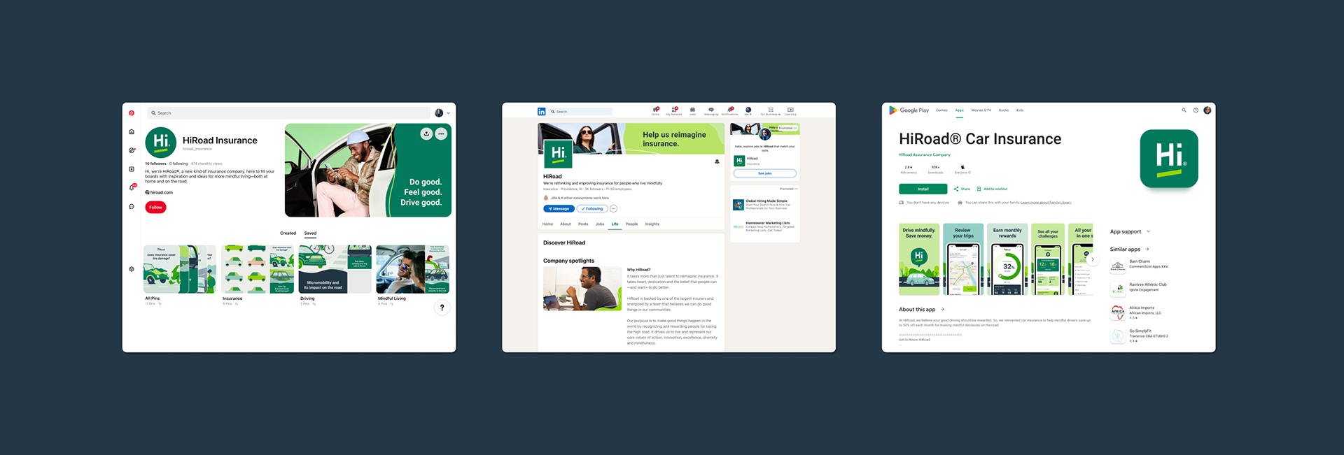
Over the years, HiRoad’s brand had evolved across multiple areas—photography, illustration, voice and tone, graphic elements, and typography—resulting in a fragmented and inconsistent identity. The goal was to redefine and expand the brand guidelines to create a cohesive, future-ready visual system that unified marketing and product experiences. This supported a broader mission to build a relatable and trustworthy brand that rewards positive actions, drives awareness, boosts engagement, and creates a distinct position with HiRoad's target audience.
Target Audience: Mindful Mobilites
Mindful Mobilites see themselves as change–agents. They thrive on self growth, because they enjoy learning and discovery. They value community for support and achieving their personal goals and want to offer the same guidance and help to others. They weigh pros and cons to ensure each new opportunity they pursue adds value and enhances their life. And they are driven by technology, with a preference for new and low cost providers.
Final Deliverables & Impact
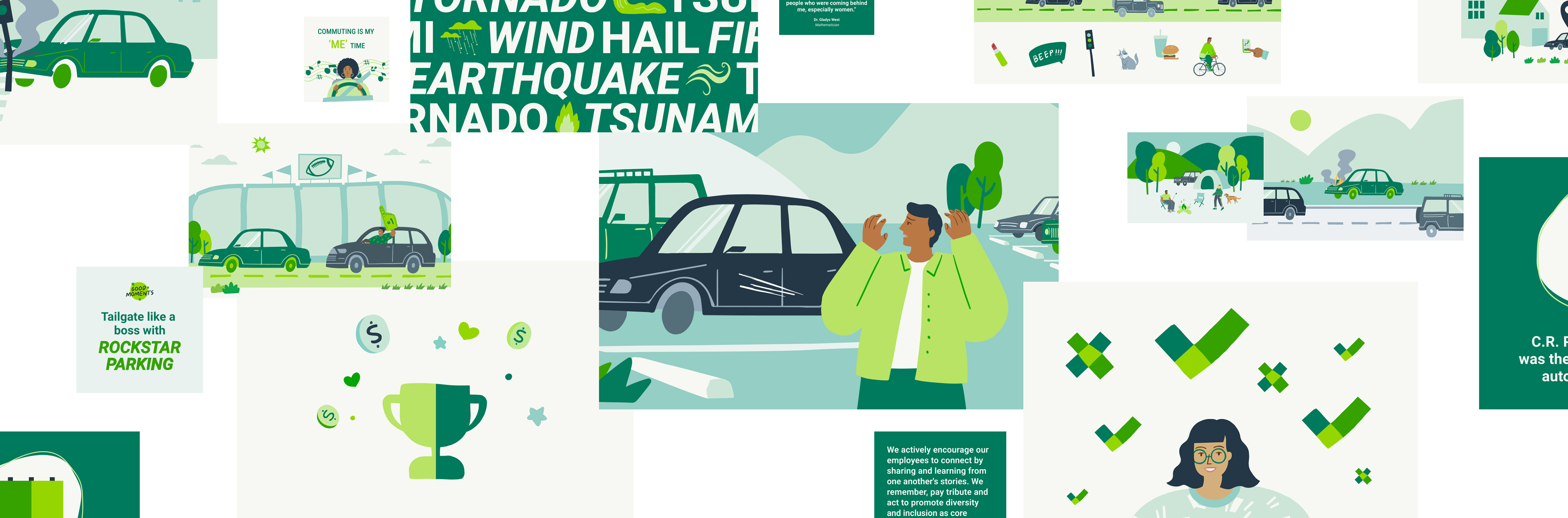
• Introduced a modern, singular illustration style, replacing inconsistent visuals.
• Refreshed graphic elements, typography, and photography to align with HiRoad’s evolving vision.
• Established comprehensive guidelines for logo usage, motion design, and grid systems.
• Developed a flexible badge system with a Figma component library for seamless implementation.
This redesign resulted in a polished, scalable brand system that reinforced HiRoad’s positioning and ensured consistency across all touchpoints.


My Role
In addition to contributing to the overall brainstorming, development, and implementation of HiRoad's full brand guidelines, I was responsible for designing and curating key chapters including logo specifications and usage, color palette, typography, and grid system. I also developed a clean, flexible layout template that served as the foundation for the entire guidelines document.
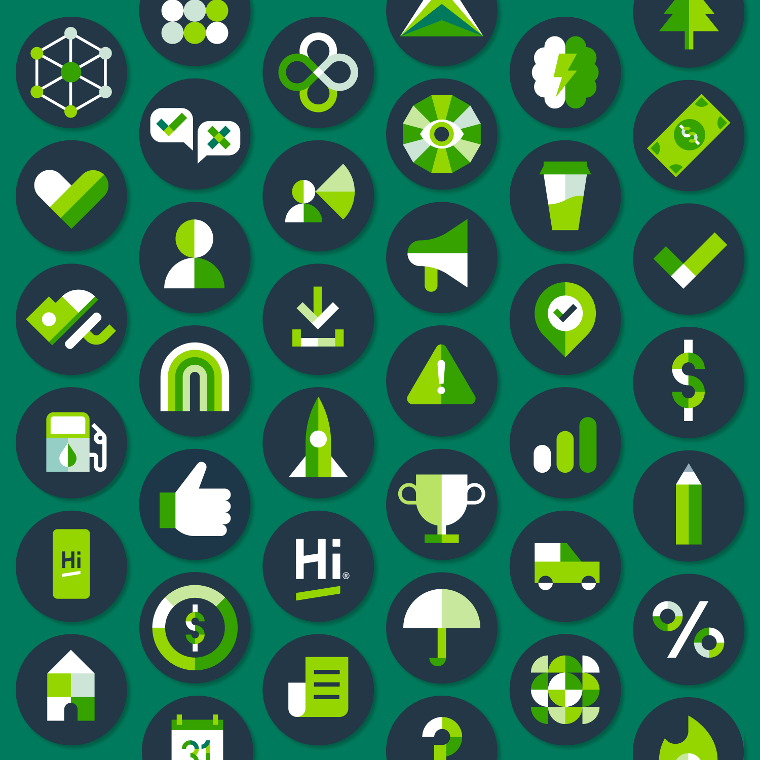
I owned the evolution of the badge system, aligning it with the updated guidelines while building in flexibility to support future product and brand needs. This involved taking inventory of the existing badge library, expanding it from 100 unique badge designs to a total of 534 badges by applying the new color palette across three distinct colorways. I also created a Figma component library for product and engineering implementation. Each colorway — Graphite, Forest, and White — was carefully designed to maintain consistent color weight and contrast, ensuring functionality in greyscale and other specific use-case scenarios.
Responsibilities at a glance
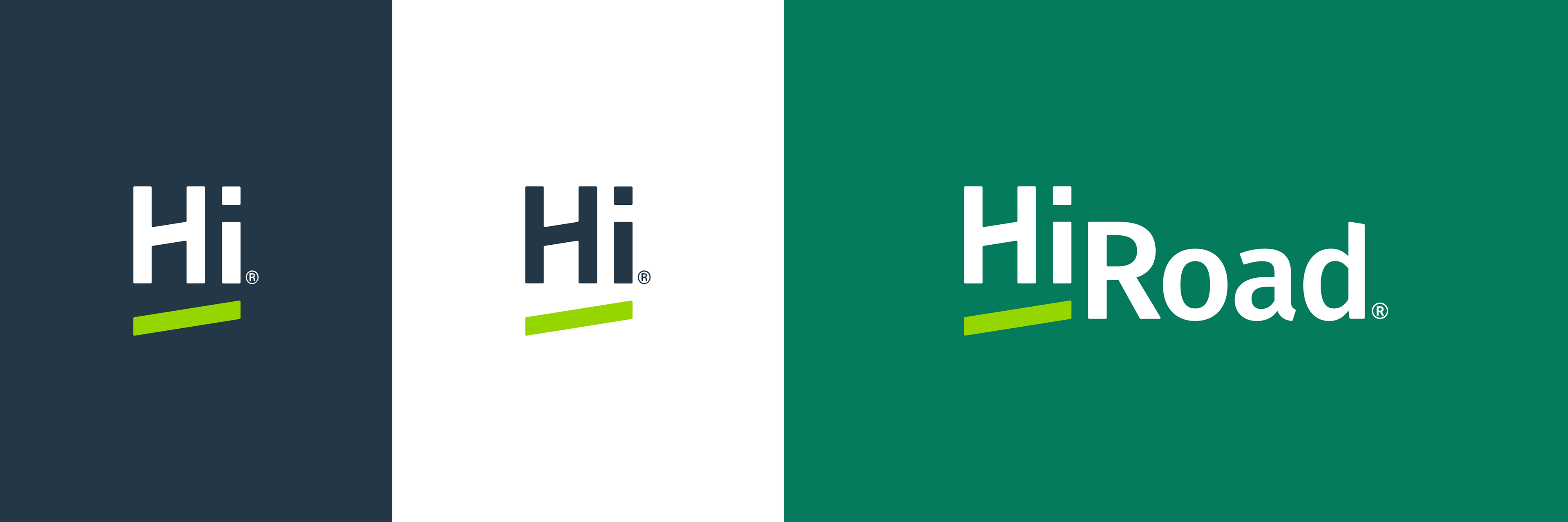
Logo specifications & usage
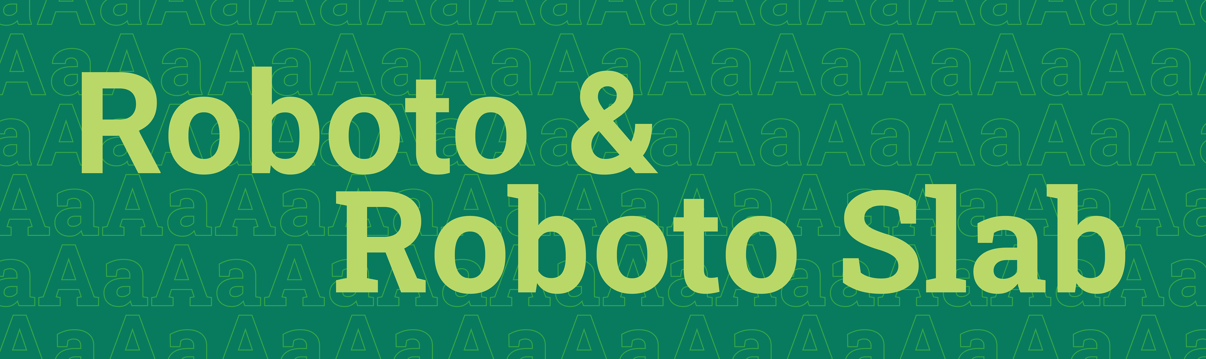
Color palette & typography
Grid system & guidelines template
Badge system evolution & Figma component library creation
Team
Mike Henderson, Creative Director
Jille Natalino, Associate Creative Director
Chad Lott, Copywriter
Grant Loving, Motion Designer
Jessie Hsu, Designer/ Illustrator
Katie Quinlan, Designer

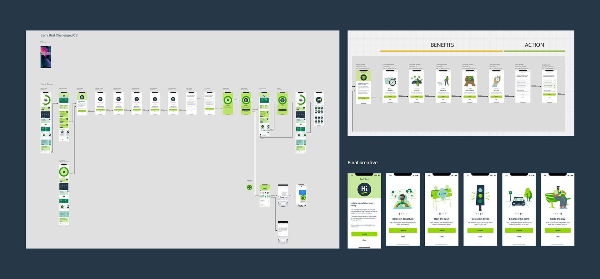
OOH HiRoad "Road Trip for Good" Campaign
